
Statistical literacy: Seven simple questions for policymakers
Abstract
Information literacy, data literacy and statistical literacy overlap when they deal with data as evidence in arguments. All three require analysis and evaluation. To effectively evaluate data as evidence, policymakers need to untangle social statistics from arithmetic numbers. Social statistics are numbers in context – where the context matters. Social statistics are socially constructed – just like words. They are generated, selected and presented by people with motives, values and goals. Social statistics can be influenced. Policymakers need to evaluate quantitative evidence using the same skills they use in evaluating other evidence. Ask questions! This article presents seven simple questions that apply to all social statistics.

1.Introduction
Data literacy, information literacy and statistical literacy are new areas for many policymakers. There is a substantial overlap between these three literacies when they generate a statistic or a statistical association [1]. These statistical results require analysis and evaluation. Analyzing and evaluating are things that policymakers normally do. Yet these may seem like new situations when they involve statistical data.
Most policymakers are used to facing new situations: situations for which they have little prior experience. To handle such situations, they ask questions. This is how policymakers get the information they need. Unfortunately some policymakers are not used to asking questions about statistics. In order to ask good questions policymakers need to know something about statistics.
Policymakers need to recognize the vast difference between statistics and numbers. Numbers are more like book-keeping: arithmetic operations that don’t involve assumptions or choices. Statistics are different – very different. Statistics deal with reality. It is easier to lie, to mislead or to prevaricate with statistics. In arithmetic, 1
2.Seven questions
Policymakers typically deal with statistical summaries obtained from large amounts of data for a group or time period. To understand and evaluate statistics properly, policymakers need to focus on a few simple but essential questions. Here are seven.
1. How big? How much? How many?
These simple questions can reveal a lot. Sometimes, the actual effect size is never mentioned. The simplest way to avoid size is to indicate a direction. “The more soda consumed, the greater the person’s weight.” Or “Accounting majors who took a CPA review course were more likely to pass the exam than those who did not.” Another way to avoid size is to use ‘many’ or ‘often’: “Many scientists believe that much of global warming is man-made” or “School dropouts (leavers) often end up in prison.”
If possible, ask a follow-up question: “By how much?” If asking a question is impossible, you have little reason to consider the argument. Think of why the size wasn’t given. Direction or quality words are convenient distractors in place of a quantity when the size is small. If it were big, they would tell you. Without a size or quantity, there is no basis for saying a statistical difference or change is important. Without numbers, statistical comparisons may be suggestive, but unimportant or even meaningless.
2. Compared to what?
A given statistic may seem small or big. But without comparing it to something relevant, it is difficult to analyse or evaluate it. The simplest case involves a count or total. In Dec 2021, Florida had 466,000 unemployed, New Jersey has 280,000 and California had 1,238,000 [2]. Florida has more unemployed than New Jersey. But why was New Jersey chosen? Was it to make Florida’s count look big? Florida has fewer unemployed than California. Was California chosen to make Florida’s count look small?
Whenever you are given a comparison, think about what other comparison might have been given. Why was this comparison given rather than others? Everyone has motives, values and interests. Everyone has an agenda. Statistics are no different than words. People choose the words and the statistics that best support their agenda. Typically, the basis of a comparison is selected to generate an association that supports someone’s agenda.
3. Why not a rate?
We don’t need higher math to know that rates can control for the size of a group. When given a count, ask “Why not a rate?” In December 2020, the number of unemployed workers was 465,000 in New York City. Is this big or small? Rates provide an internal comparison. The unemployment rate among the civilian labor force in New York City was 12%.
Even though rates may be better than counts, a rate has just slightly more context than a count.
New Jersey had a COVID-19 death rate of 25.6 deaths per 1,000 cases as of May 2021. You would not know that New Jersey had the highest COVID-19 death rate per case of any state in the US.
Lithuania has a death rate of 14.6 per 1,000 population as of May 2021. Without a comparison you would not know that Lithuania has one of the highest Covid death rate per capita in the world.
We can combine #3 (Why not a rate?) with #2 (Compared to what?) We can compare rates of two groups at the same time (or one group at two different times):
• In April 2020, the unemployment rate was higher in New Jersey (15.3%) than in Florida (12.9%).
• The US unemployment rate was higher in April 2020 (14.7%: Covid peak) than in October 2009 (10%: recession peak).
When given a comparison of counts, ask why not a comparison of rates. In April 2021, the number of unemployed workers was bigger in Florida (487,000) than in New Jersey (333,000). But, the unemployment rate was smaller in Florida (4.8%) than in New Jersey (7.5%).
Rates have their ‘downside’. Converting an absolute change into a rate of change can convert a small number (a one point increase in going from 1% to 2%) into a large number (a 100% increase).
4. Per what? The diabolical denominator.
Sometimes there is a choice in selecting the basis in a rate (the denominator in a fraction). The choice of the denominator can influence the size of a comparison and even change its direction [3].
#1: Two denominators, same time. Compare COVID-19 death rates by country. See Fig. 1.
Figure 1.
COVID-19 death rates by country.
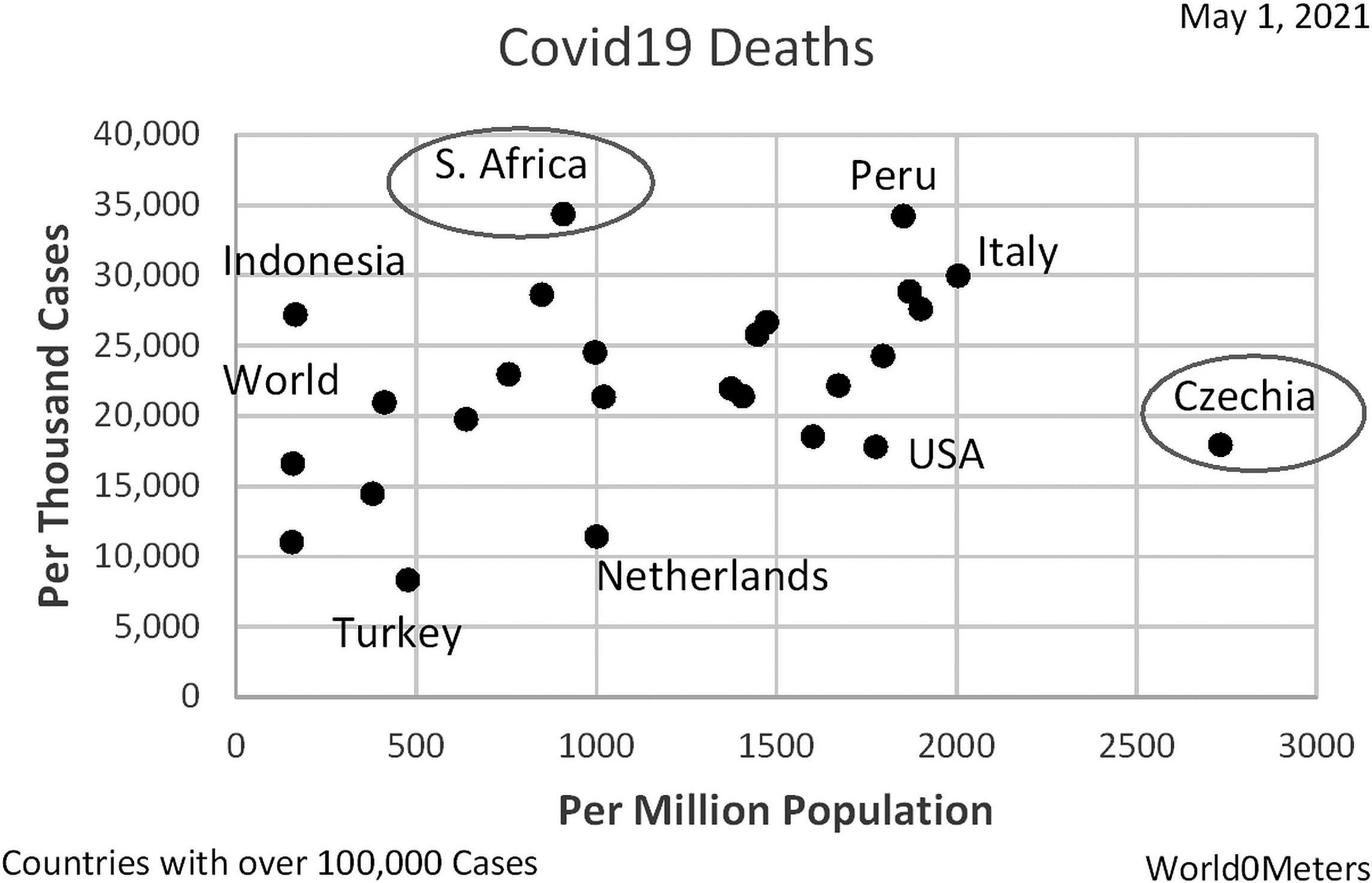
The COVID-19 death rate is higher in South Africa than in Czechia per case (the vertical axis), but lower per capita or person (the horizontal axis). Why the difference? The relationship between the denominators (cases and population) differs for the two groups.
#2: Two denominators, same time: The 1996 auto death rate was higher in Hawaii (35) than in Arkansas (7) per 1,000 miles of road; but lower in Hawaii (19) than in Arkansas (38) per 100,000 vehicles [4, 5].
#3: Two denominators, over time. Can the birth rate per 1,000 women ages 15–44 be going up over time while the birth rate per 1,000 women (all ages) be going down – for the same country over the same time period? Yes! The birth rate among potentially fertile women (15–44) might go up after a depression or war. The birth rate among all women could go down if women are living longer. The choice of the denominator can change the direction of a comparison.
#4: Multiple denominators: There are more choices for Covid death rates than just per capita and per case. Consider two US states: Michigan (Mich.) and Rhode Island (RI) [3]. See Fig. 2.
Figure 2.
COVID-19 death rates for two US states.
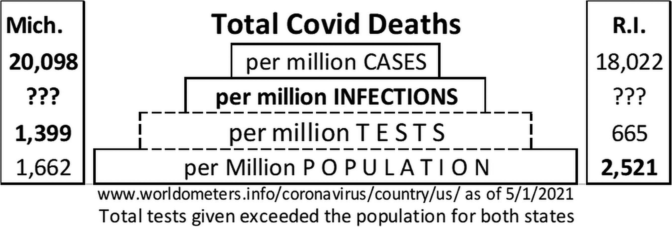
Rhode Island has a higher Covid death rate than Michigan per capita (per million population). But Michigan has a higher Covid death rate than Rhode Island per test and per case. So which is ‘right’?
Per capita (per population) includes those infected and those uninfected. Per Test typically involves those symptomatic (infected or not) but excludes those infected but asymptomatic. Per case includes those infected who test positive, but excludes those infected who weren’t tested.
Per capita is too big as a denominator: it includes all those uninfected. Per test is generally too big as a denominator. People in contact with the public at work may be tested regularly regardless of whether they show symptoms. Per case is generally too small as a denominator. It excludes those infected but untested.
What might be better is per infection. The problem is that we don’t have that data. So we must argue which of the other per denominators is closest to infections. Statisticians have no expertise on which of these is best. But we can say that Covid death rates can be influenced by the choice of the basis – the denominator.
5. How were things defined, counted or measured?
For years, Cuba was touted as having a very low infant mortality rate: infant deaths per 1,000 births during the first year after birth.
In 2017, the infant mortality rate (IMR) per 1,000 live births was supposedly lower in Cuba (4.1) than in Canada (4.5) or the US (5.7) [6].
A simple way to lower the rate in Cuba is to count a few of the deaths in the first month after birth (neonatal) as late pregnancy deaths (late fetal). With around 100,000 births per year, the stated difference of less than 2 infant deaths per 1,000 live births (5.7 minus 4.1) would involve reclassifying less than 200 early-post pregnancy infant deaths as late pre-pregnancy deaths.
6. What was taken into account (what was controlled for)? Is this a crude association?
Suppose that you are told that Mexico has a better health care system than the US. You might ask, “What is the evidence?” The death rate per thousand population is lower in Mexico (5.2) than in the US (8.2). The rates take into account the difference in population size between Mexico and the US. But these rates are still crude statistics; their association is a crude association. These rates didn’t take anything else into account that is relevant – such as age. Most comparisons of social statistics are crude comparisons. True but misleading.
7. What else should have been taken into account (controlled for)?
This question involves hypothetical thinking. Hypothetical thinking does not require a high IQ or knowledge of advanced math. Just asking some very simple – but practical – questions, can open up some very helpful discussion. Hypothetical thinking does require some knowledge of the situation.
#1: What else would be relevant in comparing death rates for Mexico and the US? Age! Older people are much more likely to die than younger people. Mexico has a much younger population than the US. The median age is 29 in Mexico, 38 in the US. The percentage who are seniors is 7.8% in Mexico, 16.5% in the US. This confounder helps explain why the death rate per thousand population is even lower in Gaza (3.5) than in Mexico (5.2).
Table 1
Covid death rates: Crude and standardized
|
Suppose you asked those comparing the death rates of countries if they had taken into account age. Suppose they said “No.” Do you have to argue that they were wrong? No! The burden of proof lies with those making the claim. Policymakers are not experts, but they can ask questions. The simplest way to take something into account for a rate or percentage is selection. In the case of the death rates, a policymaker can say,
“I’m not convinced. I’d be more convinced if you had taken age into account. For example, show me the death-rate comparison for seniors and for all others (the non-seniors). If Mexico has lower death rates for each group, then I’d be more persuaded by your claim that Mexico has better health care than the US.”
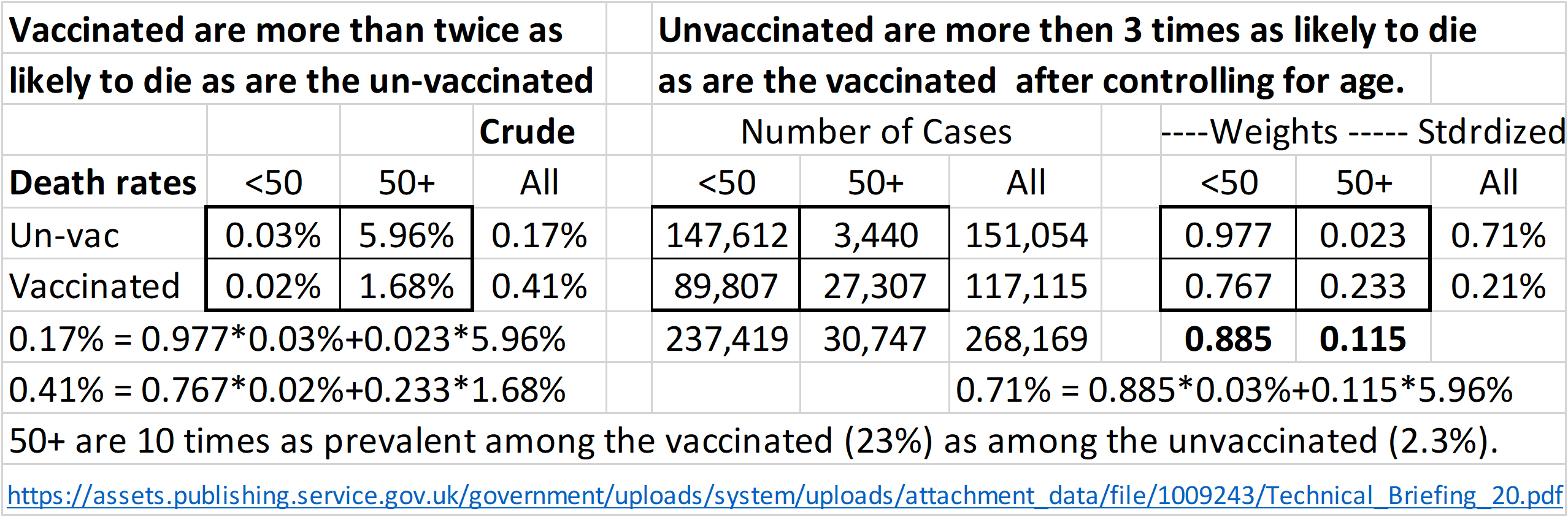
#2: To fully understand what it means to ‘take into account’ (to control for) a related factor when comparing rates, consider this example. The UK National Health Service reported that Covid deaths were 2.4 times as likely among vaccinated cases (0.41%) as among unvaccinated cases (0.17).” The data supporting this counter-intuitive result is shown in Table 1 [7].
So, what else should have been taken into account? Age is an obvious factor. Elderly cases are more likely to die than young cases. Selecting on age shows the reversal.
• For those cases under 50, death was 1.5 times as likely among the unvaccinated (0.03%) as among the vaccinated (0.02%).
• For those cases 50 and older, death was 3.4 times as likely among the unvaccinated (5.96%) as among the vaccinated (1.68%).
Fine. Selection on age groups untangles this confounding situation. But what does it mean “to take something into account”? First, recognize that the original comparison of two death rates is a crude comparison – it doesn’t take anything else into account. As such, it may be (and often is) a “mixed fruit comparison”: an “apples and oranges comparison”. A simple way to adjust the mixtures is standardization: give both groups the same mix of ages. This can be done graphically [8] or arithmetically.
Table 1 shows the arithmetic details. Note the imbalance in ages between vaccinated and unvaccinated. Those 50 and older are 10 times as prevalent among the vaccinated (23%) as among the unvaccinated (2.3%). This is what creates the “mixed-fruit” comparison.
The two death rates in the “Crude-All” column are weighted averages. The weights are based on the number of cases in the center section. Those 50 and older are 2% (3.44k/151k) among the unvaccinated, 23.3% (27.3k/117.1k) among the unvaccinated. The calculation of the two crude death rates are shown in the lower left corner of Table 1.
To standardize, give both groups the same mix of age groups: the age weights for the two groups combined. These are based on the cases by age for unvaccinated and vaccinated in the center section. The 50 and up is 11.5% (30,747/268,169). In the right section, both groups (vaccinated and unvaccinated) were given the same mixture as the combined group; 11.5% for the 50 and up. Using the same death rates as were originally observed in all four disaggregated groups, new standardized death rates are calculated. The calculation for the unvaccinated is shown in the lower right.
After taking into account age, Covid deaths were 3.4 times as likely among the unvaccinated (0.71%) as among the vaccinated (0.21%).
This is an incredible change: a reversal after taking into account a single related factor.
So, if you think a crude association of rates or percentages may be influenced by a third factor, and this third factor has just a few values, then ask for the size of the comparison for each value of that third factor. Selection is the simplest way to control for the influence of a related factor on a comparison of rates or percentages. If you can talk to those presenting the data, ask why they didn’t take into account related factors that might change the crude association?
Remember, the burden of proof is on those making the assertion.
3.Conclusions
This article recommends that policymakers consider seven simple questions: How big? Compared to what? Why not rates? Per what? Defined, counted or measured how? What was controlled for? What should have been controlled for?
These questions are simple and straightforward. The main thing is for policymakers to treat statistics the same way they treat people. People have motives, values and agendas. So do statistics – because they were selected, assembled and presented by people who have motives, values and agendas. Statistics are closer to words than to numbers. Yes, statistics involve numbers, but statistics are numbers in context and the words give the context.
Once policymakers are comfortable with these seven basic questions, they are ready to ask more complex questions. How was the data generated? What kind of study design was involved? The moral for statistical literacy (as for anything involving evidence): “Good policymakers ask good questions!”
Acknowledgments
Thanks to Cynthia Schield and Marc Isaacson for their suggestions. Thanks to the three SJIAOS reviewers for their helpful critiques and suggestions.
References
[1] | Schield M. Information Literacy, Statistical Literacy and Data Literacy. (2004) A. Available at www.statlit.org/pdf/2004-Schield-IASSIST.pdf. |
[2] | |
[3] | Schield M. Statistical Literacy: The Diabolical Denominator. Mathfest Online. (2021) . Available at www.statlit.org/pdf/2021-Schield-MathFest.pdf. |
[4] | 1998 US Statistical Abstract, |
[5] | Schield M. The Social Construction of Rankings. (2010) . |
[6] | Pablo de la Horra L. Why Cuba’s Mortality Rate is So Low. (2021) . Available at https://fee.org/articles/why-cubas-infant-mortality-rate-is-so-low/. |
[7] | Schield M. Simpson’s Paradox: Covid Death Rates UK. ASA JSM Birds of a Feather. (2021) . Available at www.statlit.org/pdf/2021-Schield-Simpsons-Paradox-Covid-UK.pdf. |
[8] | Schield M. Presenting Confounding Graphically Using Standardization. Stats Magazine. ASA. (2006) . Available at www.statlit.org/pdf/2006SchieldStats.pdf. |
[9] | Best J. People Count: The Social Construction of Statistics. Talk at Augsburg College. (2002) . Available at www.statlit.org/pdf/2002BestAugsburg.pdf. |
[10] | Schield M. Statistical Literacy: A Short Introduction. Technical Report. (2010) . Available at www.statlit.org/pdf/2010Schield-StatLit-Intro4p.pdf. |
[11] | Schield M. Statistical Literacy: Thinking Critically About Statistics. Significance. APDU. (1999) . Available at www.statlit.org/pdf/2019SchieldIASE.pdf. |
[12] | Schield M. Statistical Literacy and Liberal Education at Augsburg College. Peer Review. AAC&U. (2004) . Available at www.statlit.org/pdf/2004SchieldAACU.pdf. |
[13] | Schield M. Statistical Prevarication: Telling Half Truths Using Statistics. IASE. (2005) . Available at www.statlit.org/pdf/2005SchieldIASE.pdf. |
[14] | Schield M. Assessing Statistical Literacy: Take CARE. IASE Round Table. (2010) . Excerpts available at www.statlit.org/pdf/2010SchieldExcerptsAssessingStatisticalLiteracy.pdf. |