
How to present your data I: Graphs
1Introduction
A major aspect of a research report is analysing and reporting the data. Tufte [1] outlined the basic structures of data presentation as, the sentence, the table, and the graphic, and commented that the sentence only really allowed the presentation of two numbers and prevented comparisons [1]. When reporting data, figures and tables can feature prominently and simplify the understanding for the reader [2]. How to display data has been a topic of discussion for over 200 years, [3] effective presentation techniques will enhance a paper, [4] while poor presentation will obscure meaning and leave the reader uninformed [3, 4]. This is the first of two papers, it will deal with presenting research data in graphs, a second further paper will outline the steps involved in producing data tables.
2Principles for the graphical display of data
Sadly, data presentation is too often neglected in the communication process [5]. Developing an appropriate figure to display your findings is perhaps the single most important part of communicating a data set. A good graphic can tell the story of an entire data set and greatly ease the load on the reader in a time of increasing scientific output by summarising findings in a single picture that is quick to digest and highly informative [5]. Anyone undertaking quantitative research is advised to graph first before undertaking any formal statistical analysis to gain an impression of the data’s story [4, 6]. In fact, graphics are often the simplest and most powerful way to display data, allowing the viewer to explore and reason about the data presented and, if well-designed, permit the concise display of billions of bits of information on a single page [1].
Graphics can also make or break a manuscript’s chances of being accepted for publication during the peer review process. They have the capacity to make results clear and memorable [7]. High quality figures instantly communicate information honestly and show a high level of scientific professionalism and integrity [6]. This means that, not only is the production of a high quality graphic important, but it must be the best type of graphic to display the data with highest possible precision.
Despite the aforementioned critical importance of good quality graphics, a significant amount of low quality graphics are still produced in peer reviewed journals [8, 9]. Indeed, entire articles [3] and book chapters [4] have been written about the poor display of data. Wainer [3] identified ‘the dirty dozen’, twelve techniques that commonly underlie poor data display, that range from not showing all the data, to poor use of scales and labelling. Bad graphics not only make your data set difficult to interpret, but can make the data lie to the reader, thereby undermining the effort put into obtaining the data in the first place. This paper will outline some key guidelines for displaying various types of data to help the reader avoid falling into these traps.
2.1Types of display and when to use them
Assuming you have decided that your data is interesting enough to warrant a graphic (if it’s not, try communicating another way), the first step is generating an understanding of the options available to you and when best to use them. Most types of graphic have merits but one size does not fit all; the type of data and number of variables you have will determine which is best to use.
The reader should be aware that there are numerous ways of grouping types of data [10]. For the purposes of choosing a type of graphic, we differentiate between categorical, discrete and continuous data. Categorical data can be separated into distinct groups with no intrinsic numerical value (such as ethnic group). Discrete (or count) occurs when data can be counted (such as number of students in a class). Continuous data occurs when data can be measured at any value on a scale (such as height or weight).
When you have identified how many variables and what type of data you have, refer to Table 1 to decide what type of graphic would best suit the purpose. Please note the conspicuous absence of the pie chart in Table 1. As Tufte [1] said, the only thing worse than a pie chart is several of them. Pie charts do not order numbers in any useful way and can contain an extremely low amount of data, so for these small data sets it’s almost always better to use a table.
Table 1
Types of graphics to display data types and number of variables
| Type of graphic | Data Type | Number of Variables | Notes |
| Bar Chart | Categorical, Count | Normally univariate | Use cluster and stacked bar charts to display two or more sets of proportions |
| Dot Plot | Continuous | Univariate | Can be used to show all data points for <100 subjects |
| Histogram | Continuous | Univariate | For larger samples the continuous scale is broken into equally spaced non-overlapping bins and frequency data is displayed on the vertical axis |
| Scatter Plot | Continuous | Bivariate | Shows the relationship between two continuous variables |
| Bland-Altman Plot | Continuous | Bivariate | Proposed as a more informative alternative to the scatter plot |
| Time Series | Continuous, Count | Bivariate | Use to display data measured over time |
2.2Key principles in the use of graphics
When you create a graphic of any type, there are a number of key principles that can help you ensure that you produce displays which showcase your data in the best possible way. Several authors [1, 11, 12] have identified key principles of good graphics which we have condensed into three key points for you to follow:
1. Above all else show the data;
2. Maximise the data-ink ratio;
3. Revise and edit.
The first priority of your graphic is to guide the viewer to a truthful story of the data. This far exceeds the importance of using a figure for aesthetic purposes. The graphic should never mislead or show the data out of context in a way that allows it to be misconstrued. Think carefully about the scales and labels you are using and proportions you are displaying.
Once the figure displays the data truthfully, aim to maximise the data ink ratio [6]. This is the ratio of non-erasable data ink to the total ink used in the graphic; every dot of ink in your figure should be there for a specific reason. The first step to achieving a strong ratio is to erase ink that is not representing data, helping draw attention to the story of the figure. Gridlines are a good place to start. If you feel the need to spice up your figure with any extras, it’s likely the data is not interesting enough to warrant a graphic in the first place.
The final step to producing a graphic is revising and editing. In the same way you would spend more time on editing your prose than writing, you should also spend time revising and editing your graphics. Repeat this process until you are satisfied that you have met the key criteria and you have a truthful, informative and easy to use graphic.
2.2.1Examples of graphics
Table 1 listed some types of graphic that could be used to display data effectively. The aim is to now give some examples of these types of chart, and their associated R code is in Appendix 1.
2.2.2Bar charts
Bar charts can be used to display data classified into a number of categories. They are effective because readers can compare categories, assessing the differences between them [12]. The length of each bar represents either the count in a specific category, or the percentage of the total number of observations [13, 14]. An example of a bar chart is shown in Fig. 1. It displays data on rugby league injuries and the amount of time away from playing required [15]. Categories should be presented in a logical order [16]. In this case the data has a natural order that is displayed from left to right. Each column represents a separate category, the columns are the same width and there are gaps between columns. This is intentional, as the categories are separate, not continuous.
![Time off as a result of injury in rugby league [15].](https://ip.ios.semcs.net:443/media/ppr/2017/38-2/ppr-38-2-ppr096/ppr-38-ppr096-g001.jpg)
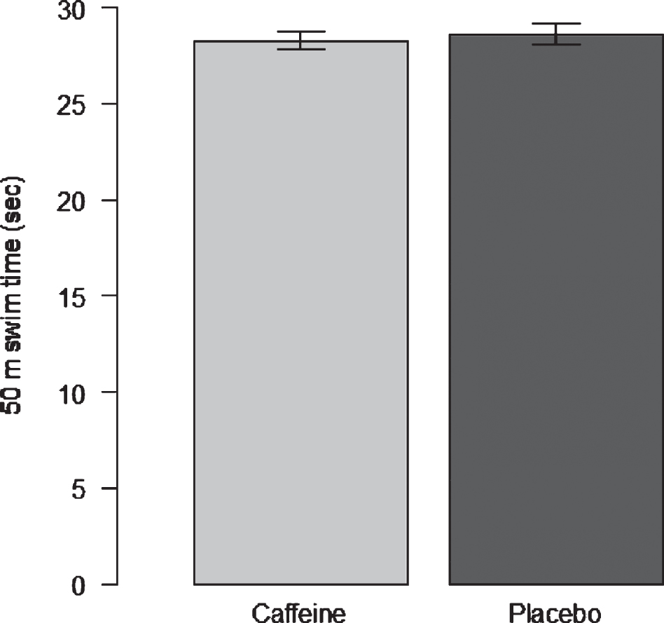
Bar charts can also be used to show continuous data, as shown in Fig. 1a. For this example, the data displayed is separated in two columns denoted by the treatment (Caffeine or Placebo). The height of the column represents the mean score. As a continuous variable (50 m swim time) is being shown, it is important to include the variability of the scores in the display. In Fig. 1a, error bars are included. Clearly, it can be seen there is little difference in either mean scores or variability.
Fig.1a
50 m swim times follwing caffeine or placebo ingestion.
2.2.3Dot plots
Dot plots are used to display individual data points from a group of observations [17]. The data points should be a set of continuous data, with each dot representing a data point. The graphic allows the reader to assess the distribution of that data. Figure 2 gives examples of dot plots, the data shown are measurement (n = 96) of the 90/90 test [18].
Fig.2
Symmetric and assymetric dot plots.
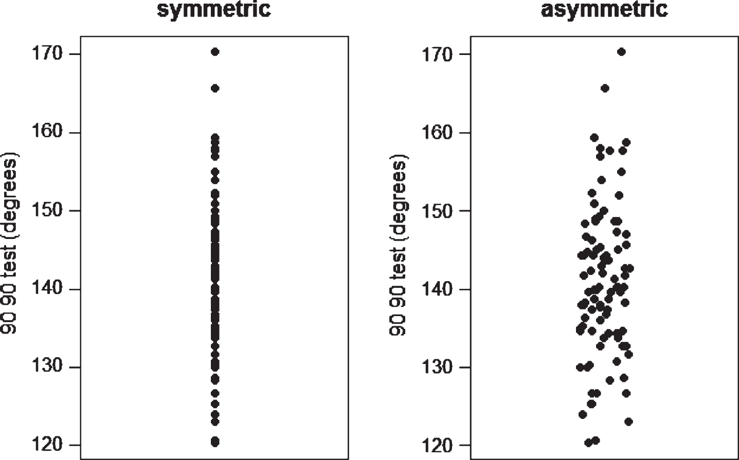
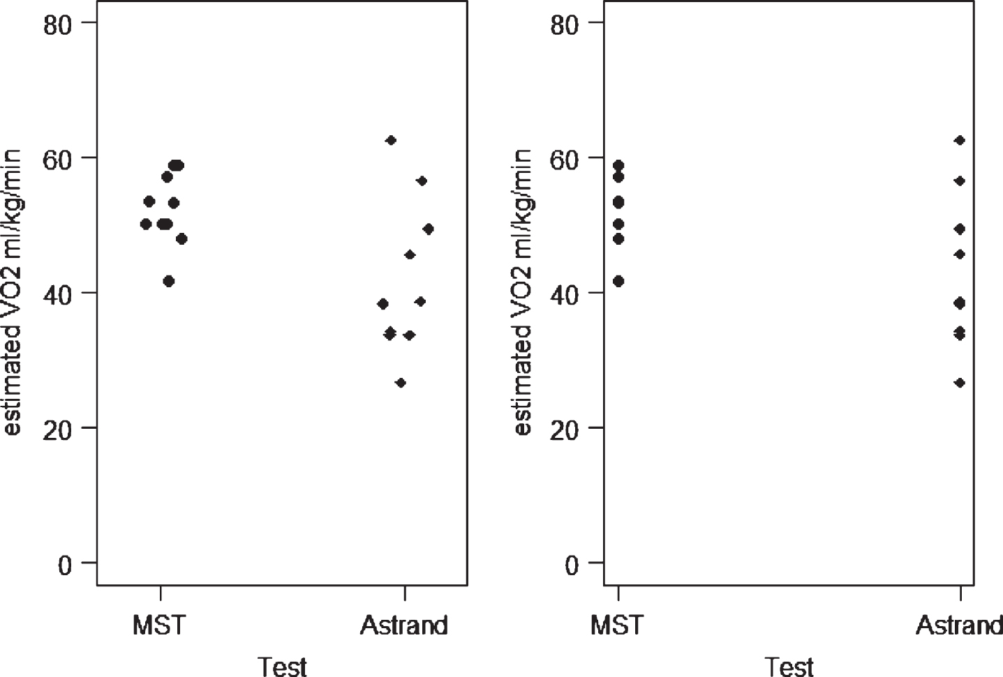
The same data is used in both dot plots, the difference being the alignment. The symmetric plot has the data points overlapping, whereas the asymmetric plot disperses similar numbers horizontally. In either case, the distribution of the variable can be assessed and it is recommended that they are particularly useful for evaluating small data sets [17]. The dot plot can also be used to compare two distributions as shown in Fig. 3. The data is estimated VO2 (ml/kg/min) using two tests the Multistage fitness test and the Astrand-Rhyming nomogram. Using either the symmetrical or asymmetrical plot, the graphs demonstrate much wider variability in the Astrand scores.
Fig.3
Symmetric and asymmetric plots of estimated VO2 max.
2.2.4Histograms
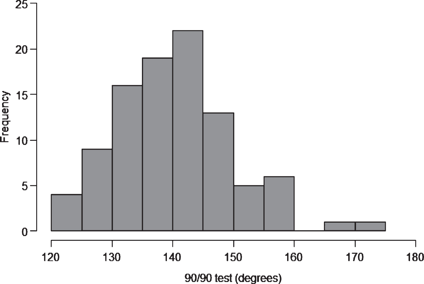
A continuous data distribution can be displayed on a histogram. They are used to display the entire distribution and give a visual impression if the distribution is distorted. For example, skewness or highlighting a bimodal distribution [6]. An example of a histogram is shown in Fig. 4, with a display of the 90/90 data [18] used in Fig. 2.The fact that the data is continuous is reflected in the x axis, no gaps between the columns of data and the columns being the same colour. Each column should be the same width [16]. The choice of the width is important, too few will smooth the data hiding important information, too many will confuse the reader by showing too much information [14, 19].
Fig.4
The distribution of 90/90 test scores.
2.2.5Scatter plots
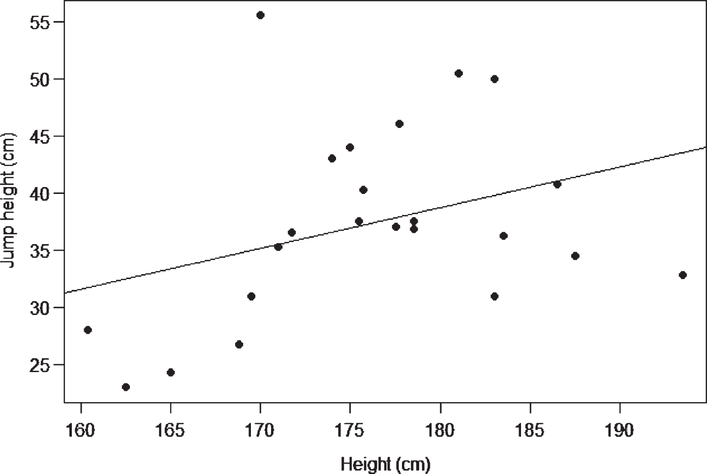
A scatter plot or scattergram [20] is used to visually examine the relationship between two continuous variables [19]. The values for one variable are plotted on the x axis and the other on the y axis. The individual data points displayed are coordinates of the x and y values [14]. When using a scatter plot two distinct situations can arise, which correspond to correlation or regression statistics [4, 14, 19]. If the intention is to display the relationship between variables, then the choice of variable for the x and y axis is a matter of choice [14]. However if there is a known or suspected relationship between the two variables then the independent variable should be on the x axis and the dependent variable on the y axis.
Figure 5 is a scatter plot of the heights of 23 males and their jump heights. In this example, height is the independent variable and jump height the dependent variable. It is suspected that jump height is a function of height. The correlation between height and jump height is r = 0.35. The line displays the regression of jump height as a function of height (jump height = –25.57 + [0.35 * height]).
Fig.5
Scatter plot of height and jump height.
2.2.6Bland-Altman plots
Scatter plots can be used for other functions. Perhaps one of the better known of these is the Bland-Altman plot [21]. The technique is designed to look at the differences between two measurement methods on one variable. Figure 6 is a Bland-Altman plot of the original data, [21] which sought to show the measurement agreement between two peak flow meters. Essentially, it is a scatter plot with some added features. The solid line is the average difference between the two methods (–2.17 l/min), and the broken lines are the 95% limits of agreement (–78.1 to 73.86 l/min). The plot informs the reader as to what is likely to happen 95% of the time [22]. Freeman [4] summarised three observations from the plot:
![Bland-Altman plot using original data [21].](https://ip.ios.semcs.net:443/media/ppr/2017/38-2/ppr-38-2-ppr096/ppr-38-ppr096-g006.jpg)
i The differences between measurements;
ii Their distribution around zero;
iii If the difference are relate to the size of the measurement.
The Bland-Altman plot is very popular and at the time of writing the paper [21] has in the region of 30,000 citations.
2.2.7Time series plots
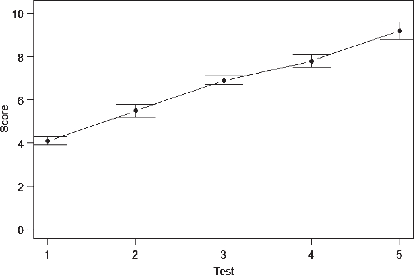
There are times in research when several measurements are taken on a group of individuals over time. Any pre-test post-post test repeated measures design is an example of this. But, sometimes the participants might be assessed over several time periods. An example of a time series plot is shown in Fig. 7. The order in which the tests were conducted is maintained in the display. As the data is continuous data, the variability needs to be shown, hence the error bars with each data point.
Fig.7
Time series plot over five test periods.
The R code used to produce the graphs is contained in Appendix 1. Efforts were made to use the functions in the base package as much as possible, but please be aware that there are many other R packages that may well do the job more effectively, please investigate.
In this paper we have outlined the main functions and properties of graphs, and illustrated those points with examples. Whenever a researcher chooses to display data in a graph, deliberation and preparation should be the first steps. The aim should always be to display the data clearly and effectively. Make the reader’s task as easy as possible, that way the message will get across. To do this, ask your colleagues to look at your graphs and ask them, “ ... am I getting the message across?” if you are not, try again.
Conflict of interest
None to report.
Appendices
Appendix 1
R code used to produce the graphs
########################################
## Bar chart
########################################
setwd(“D:{}Teaching statistics/Graphics/Data Source”)
injury< -read.csv(“injuryCSV.csv”)
attach(injury)
names(injury)
table(time_off)
time_factor< -factor(time_off)
time_factor
time_factor2< -factor(time_factor, levels = (c(“<1 week”,“1-2 weeks”, “2-3 weeks”, “3-4 weeks”, “>4 weeks”)))
time_factor2
time2< - table(time_factor2)
colours = c(“red”, “blue”, “green”, “yellow”, “lightgray”)
barplot(time2, col = colours, las = 1, ylim = c(0,120), cex.names = 0.8, ylab = “Frequency”, xlab = “Time off”,
names.arg = c(“<1 week”,“1-2 weeks”, “2-3 weeks”, “3-4 weeks”, “>4 weeks”))
########################################
## Bar chart using continuous data
########################################
setwd(“D:/Conor/Teaching statistics/CGissane articles/ /Graphics/Data Source”)
caf< -read.csv(“Caffeine2CSV.csv”)
attach(caf)
names(caf)
means< -tapply(Time, Treat, mean) # Calulate the means
sem< -tapply(Time, Treat, sd)/sqrt(tapply(Time, Treat, length)) #Calculate standard errors
dist< -means-sem #Mean to lower bound
distu< -means+sem # mean to upper bound
## Draw box plot and add error bars
colour< -c(“lightgrey”,“gray35”)
mids< -barplot(means, ylab = “50 m swim time (sec)”, ylim = c(0,30), col = colour, names = c(“Caffeine”,“Placebo”), xlim = c(0,2),width = 0.5, las = 1)
arrows(x0 = mids, y0 = dist, x1 = mids, y1 = distu, code = 3, angle = 90, length = 0.15)
########################################
## Dot plot
########################################
a9090< -c(137.3, 148.7, 152.0, 126.7, 130.7, 142.3, 165.7, 138.0, 134.7, 131.7, 145.0, 150.0,
133.7, 157.7, 158.7, 149.3, 130.3, 143.0, 158.0, 147.0, 141.7, 144.3, 139.7, 144.3,
135.0, 140.3, 138.7, 140.3, 140.3, 140.0, 120.3, 147.3, 138.7, 142.7, 120.7, 149.0,
125.3, 130.0, 123.0, 157.7, 133.7, 134.3, 144.7, 152.3, 145.3, 140.0, 132.7, 132.7,
159.3, 126.7, 132.7, 139.7, 148.3, 126.7, 136.3, 154.0, 143.7, 134.3, 135.3, 170.3,
136.7, 140.3, 155.0, 145.0, 146.3, 136.0, 148.7, 130.0, 148.7, 137.3, 142.7, 138.3,
134.7, 134.7, 133.7, 124.0, 138.0, 144.0, 141.3, 141.7, 139.7, 138.0, 128.3, 125.3,
145.7, 138.3, 142.0, 151.0, 157.0, 134.0, 146.7, 128.7, 137.7, 143.7, 144.3, 144.3)
par(mfrow = c(1,2))
stripchart(a9090,
vertical = TRUE,
method = “overplot”, #Method = “overplot”
main = “symmetric”,
ylab = “90 90 test (degrees)”,
pch = 16, las = 1)
stripchart(a9090,
vertical = TRUE,
method = “jitter”, #Method = “overplot”
main = “asymmetric”,
ylab = “90 90 test (degrees)”,
pch = 16, las = 1)
par(mfrow = c(1,1))
########################################
## Multiple comparison dot plot
########################################
mst< -c(53.7, 58.9, 50.2, 41.9, 57.1, 53.3, 50.2, 58.9, 48.1, 50.2)
astrand< -c(38.4, 62.6, 26.8, 49.5, 34.4, 56.7, 33.8, 45.7, 38.7, 33.8)
x< -list(“MST” = mst, “Astrand” = astrand)
par(mfrow = c(1,2))
stripchart(x,
main = ””,
las = 1,
vertical = TRUE,
ylab = “estimated VO2 ml/kg/min”,
xlab = “Test”,
ylim = c(0,80),
method = “jitter”, #Method = “overplot”
pch = c(16,18)
)
stripchart(x,
main = ””,
las = 1,
vertical = TRUE,
ylab = ”estimated VO2 ml/kg/min”,
xlab = “Test”,
ylim = c(0,80),
method = “overplot”, #Method = “overplot”
pch = c(16,18)
)
par(mfrow = c(1,1))
########################################
## Histogram
########################################
par(mfrow = c(1,2))
a9090< -c(137.3, 148.7, 152.0, 126.7, 130.7, 142.3, 165.7, 138.0, 134.7, 131.7, 145.0, 150.0,
133.7, 157.7, 158.7, 149.3, 130.3, 143.0, 158.0, 147.0, 141.7, 144.3, 139.7, 144.3,
135.0, 140.3, 138.7, 140.3, 140.3, 140.0, 120.3, 147.3, 138.7, 142.7, 120.7, 149.0,
125.3, 130.0, 123.0, 157.7, 133.7, 134.3, 144.7, 152.3, 145.3, 140.0, 132.7, 132.7,
159.3, 126.7, 132.7, 139.7, 148.3, 126.7, 136.3, 154.0, 143.7, 134.3, 135.3, 170.3,
136.7, 140.3, 155.0, 145.0, 146.3, 136.0, 148.7, 130.0, 148.7, 137.3, 142.7, 138.3,
134.7, 134.7, 133.7, 124.0, 138.0, 144.0, 141.3, 141.7, 139.7, 138.0, 128.3, 125.3,
145.7, 138.3, 142.0, 151.0, 157.0, 134.0, 146.7, 128.7, 137.7, 143.7, 144.3, 144.3)
hist(a9090, main = NULL, xlab = “90/90 test (degrees)”, las = 1, col = “lightgray”, ylim = c(0,25), xlim = c(120,180))
par(mfrow = c(1,1))
cl< - colors()
length(cl); cl[1:100]
########################################
## Scatter plot
########################################
height< -c(183.0, 174.0, 186.5, 169.5, 162.5, 181.0, 183.0,
165.0, 170.0, 183.5, 177.5, 177.7, 171.0, 168.8, 178.5,
178.5, 193.5, 175.7, 175.0, 171.7, 160.4, 175.5, 187.5)
jump< -c(31.0, 43.0, 40.8, 31.0, 23.0, 50.5, 50.0, 24.3, 55.5, 36.3,
37.0, 46.0, 35.3, 26.8, 36.8, 37.5, 32.8, 40.3, 44.0, 36.5,
28.0, 37.5, 34.5)
length(jump)
length(height)
plot(height, jump, xlab = “Height (cm)”, ylab = “Jump height (cm)”, las = 1, pch = 19)
abline(lm(jump∼height))
cor.test(jump,height)
regjh< -lm(jump∼height)
summary(regjh)
########################################
## Bland-Altman plot
########################################
#Read in data
blandaltman = read.csv(“blandalt.csv”, header = TRUE)
attach(blandaltman)
bamean = (m1 + m2)/2 # calculation of mean
bamean
badiff = (m1-m2) #calculate mean difference
badiff
mdiff = mean(badiff);sddiff = sd(badiff)
mdiff; sddiff
# Find 95% LoA
Limits = sddiff*1.96 # calculate the limits
# Upper 95% LoA
upper95limit = mdiff + Limits # upper limit
# Lower 95% LoA
lower95limit = mdiff - Limits # lower limit
#Compute the figure limits
ylimh< - mdiff + 3 * sddiff
yliml< - mdiff – 3 * sddiff
# Plot data
plot(badiff ∼ bamean, xlab = “Average values (m1+m2)/2”,ylab = “Differences (m1-m2)”, ylim = c(yliml, ylimh), pch = 19, las = 1)
abline(h = mdiff) # Center line
# Standard deviations lines
abline(h = mdiff + 1.96 * sddiff, lty = 2)
abline(h = mdiff - 1.96 * sddiff, lty = 2)
mdiff # display mean difference
upper95limit # Diplay limits of agreement
lower95limit
########################################
## Line plot with error bars
########################################
d = data.frame(
x = c(1,2,3,4,5)
, y = c(4.1, 5.5, 6.9, 7.8, 9.2)
, sd = c(0.2, 0.3, 0.2, 0.3, 0.4)
)
##install.packages(“Hmisc”, dependencies = T)
library(“Hmisc”)
# add error bars (without adjusting yrange)
plot(d$x, d$y, type = “b”, ylim = c(0,1+max(d$y)),
las = 1, ylab = “Score”, xlab = “Test”, pch = 1)
with (
data = d
, expr = errbar(x, y, y+sd, y-sd, add = T, pch = 16, cap = 0.1)
)
References
[1] | Tufte ER , Graves-Morris P . The visual display of quantitative information: Graphics Press Cheshire, CT; (1983) . |
[2] | Koschat MA . A case for simple tables. The American Statistician (2005) ;59: :31–40. |
[3] | Wainer H . How to display data badly. The American Statistician (1984) ;38: (2):137–47. |
[4] | Freeman JV , Walters SJ , Campbell MJ . How to display data. Oxford: Blackwell Publishing;(2008) . |
[5] | Knottnerus JA , Tugwell P . Better data presentation in graphs and tables is possible and needed. Pergamon; (2010) . |
[6] | Stengel D , Calori GM , Giannoudis PV . Graphical data presentation. Injury (2008) ;39: (6):659–65. |
[7] | Ehrenberg ASC . A primer in data reduction: An introductory statistics textbook: Wiley; (2000) . |
[8] | Cooper RJ , Schriger DL , Close RJ . Graphical literacy: The quality of graphs in a large-circulation journal. Annals of Emergency Medicine (2002) ;40: (3):317–22. |
[9] | Cooper RJ , Schriger DL , Tashman DA . An evaluation of the graphical literacy of Annals of Emergency Medicine. Annals of Emergency Medicine (2001) ;37: (1):13–9. |
[10] | Gissane C . What kind of data do I have? Physiotherapy Practice and Research (2013) ;34: :123–5. |
[11] | Annesley TM . Put your best figure forward: Linegraphs and scattergrams. Clinical Chemistry (2010) ;56: (8):1229–33. |
[12] | Tukey JW . Data-based graphics: Visual display in the decades to come. Statistical Science (1990) ;5: (3):327–39. |
[13] | Gissane C . Understanding and using descriptive statistics. The British Journal of Occupational Therapy (1998) ;61: (6):267–72. |
[14] | Pearson JGC , Turton A . Statistical methods for environmental health. London: Chapman & Hall; (1993) . |
[15] | Gissane C , Jennings D , Standing P . Incidence of injury in rugby league football. Physiotherapy (1993) ;79: (5):305–10. |
[16] | AMA. American Medical Association manual of style: A guide for authors and editors. New York: Oxford University Press; (2010) . |
[17] | Wilkinson L . Dot plots. The American Statistician (1999) ;53: (3):276–81. |
[18] | Gissane C . Is the data normally distributed? (2016) . |
[19] | Freeman JV , Julious SA . The visual display of quantitative information. Scope (2005) ;14: (2):11–5. |
[20] | Bigwood S , Spore M . Presenting numbers, tables, and charts: Oxford Unversity Press; (2003) . |
[21] | Bland JM , Altman D . Statistical methods for assessing agreement between two methods of clinical measurement. The Lancet (1986) ;327: (8476):307–10. |
[22] | Altman DG , Bland JM . Measurement in medicine: The analysis of method comparison studies. The Statistician (1983) :307–17. |