
Data impressions for a smart city: Exploring new ways to present and engage citizens in environmental data
Abstract
We live in a world full of data being generated in exabytes by citizens, devices, buildings and assets intricately embedded in our environments. Whilst there is potential for this data to improve many things, much of it is unused and invisible to the average citizen who in turn may have switched off through ‘data fatigue’. This paper introduces the concept of the data impression through data physicalisation as a way to engage citizens in their data. Like the art impressionists of the late 1800’s (who broke away from photo-realist painting), the authors of this paper want to break away from the rendering of detailed and complex dashboards of endless and graphs and statistics to create an engaging and meaningful impression through dynamic physical objects and systems.
These ideas are explored through the detailed reporting and reflection on an 18-month data physicalisation project (Daptec) funded by the Welsh Government Smart Expertise (European Regional Development Fund). This project brought together a number of industry and academic partners around the problem of communicating environmental data relating to Flat Holm Island, a mainly uninhabited site of special scientific interest a few miles from the coast of Cardiff. The resulting physical smart technologies developed for the project were exhibited in Cardiff’s Techniquest science centre in spring 2022 with view to promoting dialogue around the island and its ecology, a more sustainable tourism and positive environmental practices for our smart cities.
1.Introduction
Many people are turning to smart city technology and design as a way to raise awareness as well as to eliminate negative environmental impacts and to tackle the local and global threat of climate change. Areas like sustainable design, inclusive design, co-design, and social design are among many fields that have emerged [13] from an awareness of the positive potentials of bringing together design, ecology and technology [23]. The project documented in this paper draws from these fields in its ambition to develop a socially impacting experience designed to reflect ecological concerns and issues. In detail, the paper focuses on the design thinking and development of data driven sculptural technologies aimed at promoting environmental awareness and engagement through the capture of data impressions. The project involved the use of environmental data relating to Flat Holm Island, a site of special scientific interest and local nature reserve situated about five miles from Cardiff in the Bristol Channel. It was funded for eighteen months by the Welsh Government Smart Expertise initiative (European Regional Development Fund), and sought to develop a ‘Data Physicalisation Technology’ (Daptec). The goal of the Daptec Flat Holm project was to communicate the ecological narratives and issues relating to the mainly uninhabited island to a wider audience through exhibition at the Techniquest science centre in Cardiff Bay. By introducing the new concept of the ‘data impression’ afforded through the data physicalisation technology, the research team focused on giving important environmental data a new and engaging form accessible and meaningful to the general public. The following sections of this paper discuss the design thinking journey of this responsible innovation project as part of a wider smart city initiative to improve the engagement with environmental data and hence increase citizen’s environmental awareness/ consciousness.
2.Smart technology, smart city and green computing
As technology on the whole has developed over the years, smart technology has become an increasingly large part of our world [6]. Smart technology can be described as a self-monitoring, analysis and reporting technology. The ‘key attributes’ of smart technology are possessing an awareness of their situation and then reacting to it [4, p. 1]. For example, common successful uses of these smart technologies involve everyday tasks that have been made easier to control and manage. These include: thermostats and home security systems that are linked to people’s phones etc. Important to note here, in terms of smart technology, critics have suggested that the consideration of social implications are being side-lined [29]. No doubt, the efficiency of smart technologies have made them increasingly popular. Indeed, smart technologies such as artificial intelligence, robotics, and the internet of things are being seen as having the potential to play an important role in productivity and eco-efficiency [29]. However, there is a clear need to encompass the responsible innovation ethos that will address and cater for the ethical, societal and regulatory challenges including digital inclusion and citizen engagement.
Saying that, the effectiveness and versatility of smart technologies allows their uses to extend beyond the everyday domestic uses. As Levenda [20, p. 1] highlights: ‘The proliferation of smart technologies, big data, and analytics is being increasingly used to address urban socio-environmental problems such as climate change mitigation and carbon control’. Moreover, cities, towns, public spaces etc. across the world have started to look into the use of smart technology to create cities known as smart cities or ‘ecocities’. Smart cities are characterised by ‘the strategic, systematic, and coordinated implementation of modern ICT applications in a range of urban functional fields’ [31, p. 3]. The goal of a smart city is to improve the lives of its citizens through advanced and integrated technologies, as well as the enhancement of sustainability and environmental issues. In line with this, there has also been an increasing discussion and movement around the concept of green computing or GreenIT. This stems from the realisation that the use of technology, though often seen as the greener option, does contribute to environmental issues such as climate change. Murugesan [26, p. 25] defines green computing as ‘the study and practice of designing, manufacturing, using, and disposing of computers, servers, and associated subsystems efficiently and effectively with minimal or no impact on the environment’. Whilst technology evolves and becomes more relevant and useful, all stakeholders (i.e. society as a whole) should be involved in the discussion of responsible innovations for their environments.
2.1.Responsible innovation and technology
Responsible innovation has the potential to have a significant impact on people’s awareness of environmental well being (i.e. sustainability-water management, carbon reduction and biodiversity support). In the smart world, it will ensure that we are alive to and addressing the ethical, societal and regulatory challenges of our cities and surrounding environments. According to Voegtlin and Scherer [39, p. 1] ‘responsible innovation that contributes to sustainable development (SD) consists of three dimensions: (1) innovations avoid harming people and the planet, (2) innovations ‘do good’ by offering new products, services, or technologies that foster SD, and (3) global governance schemes are in place that facilitate innovations that avoid harm and ‘do good’. More so than ever, our cities across the world are needing new and responsible innovations to solve the biggest and toughest global warming problem humanity has ever faced. Indeed, all ages of society need to come together to provide/ share knowledge and technologies to reduce human’s impact on the climate. As Häußermann and Schrot [12, p. 1] state ‘the concept of responsible innovation advocates the inclusion of a variety of stakeholders, in particular from society’. However, it is crucial that innovation has the ‘right impacts’... it is believed that responsible innovation can help to achieve this [22].
In the last decade, Responsible Research and Innovation (RRI) has earned a prominent position in policy spheres by offering forward-looking approaches [15]. In detail, the notion of responsible innovation suggests that innovators carry additional responsibilities (to society, stakeholders, users) beyond those commonly suggested [37]. Technologies have a big role to play here. In fact, new emerging and creative technological innovations provide the opportunities to not only deepen our understanding and awareness of the growing environmental challenges but also to give us new means to solving them. For example, green design has been advocated and developed in response to the increasingly deteriorating global environment [35]. Eco-design is being used as a tool in the product and service sectors with the aim to increase sustainability and reduce negative environmental impact [38]. Furthermore, when designing and manufacturing products, green design will greatly reduce the environment impact of such production’ [18, p. 1].
In line with this, ‘New technologies not only contribute greatly to society and the economy; they also involve fundamental societal shifts, challenging our values and ideas about ourselves and the world’ [12, p. 1]. Smart technologies have huge potential to be used in creative ways to engage us in rethinking not only our personal behaviours but also our actions as a society. Furthermore, ‘Technologies to identify individual animals, follow their movements, identify and locate animal and plant species, and assess the status of their habitats remotely have become better, faster, and cheaper as threats to the survival of species are increasing’ [28, p. 1]. As Bruynseels [2] notes digitalization of biological populations and ecosystems can change our relation towards them. Emerging technologies are increasingly promoted on the promise of tackling the grand challenge of sustainability [25]. Technologies are enabling more climate change transparency and exposure. In doing so, endeavours like smart cities are enabling the potential for change where all stakeholders can come together to play their role. And as Liu et al. [21, p. 1] state ‘in the current era of Industrial 4.0, open innovation, and the sharing economy, innovation ecosystems are formed through government-industry-university (triple helix) interaction’. The following sections introduce the concept of the data physicalisation approach taken by the Daptec project in relation to the Flat Holm island data, to afford the design of accessible and engaging data impressions through slow data experiences.
3.What do we mean by data physicalisation technology?
It may seem like an unusual and incongruous term, but data physicalisation has a long history. Jansen et. al [16, p. 3] define it as ‘a physical artifact whose geometry or material properties encode data’. This definition could comfortably apply to the common technique of charting or graphing data two dimensionally though this is often considered a data visualisation. Such approaches can be extended by introducing a ‘third axis’ to a plot (typically represented through perspective drawing or some kind of 3D computer visualisation) but still the visualisation exists in a mainly two dimensional paradigm (i.e. on paper or a screen). Data physicalisation moves the representation into a three dimensional, material and physical realm. The approach includes historical techniques for example using stones or tokens to represent numerical data such as votes [16] or the use of wooden tally sticks to keep track of financial payments and arrangements [36]. Interestingly such techniques will have in part been borne out of a pre-digital or even pre-literate necessity. Modern examples of data physicalisation are numerous and extend from scientific and industrial practices including sonification [1] through to data sculpture, installations and interactive exhibits and artworks that operate through the sonic, the visual and the hapic [14]. The Daptec project has involved reviewing a range of these examples such as the Global Data Chandelier by Sosolimited [32] and Change Ringing by artist Peter Shenai and composer Laurence Osborn consisting of a series of bells whose forms are derived from representations of environmental data. By considering such approaches alongside original experimentation, Daptec have aimed to bring both ancient and modern techniques of handling, representing and understanding data to bear on new artefacts and interactions that will make ecological data relating to Flat Holm island more engaging, meaningful and accessible to audiences.
3.1.Data and data impression
When the lay person thinks about data, they may think about numbers and statistics in a graph or chart that, whilst important, does not directly effect them in their day to day lives. The Cambridge dictionary definition of data is ‘information, especially facts or numbers, collected to be examined and considered and used to help decision-making’ or ‘information in an electronic form that can be stored and used by a computer’ [5]. However, in terms of not having an impact on us, this is often far from the truth as no matter what we do, we are always consuming, generating and surrounding ourselves with data, our interactions with electronic media being a prime example. A lot of this data may feel unimportant, irrelevant and indeed may never make a noticeable impact on the individual. But this is not the case for environmental data relating to the health and well being of the planet’s ecosystems where serious changes may be occurring in ways which are not directly perceptible to our senses.
A key term relating to data is ‘data accuracy’ referring to the degree to which data is correct. It is one of the main dimensions of data quality which makes data usable and purposeful. As Talha et al. [33, p. 1] notes ‘Knowing the accuracy of an organization’s data reflects the level of reliability it can assign to them in decision-making processes’. As part of the Daptec project’s progress we have begun to explore the notion of ‘data impression’, a term that we use to capture the idea of data impacting the human viewer / audience by way of a kind of imprint or impression left on their understanding of something by data. A data impression is not so much about portraying minute detail as it is about loose, bold and fluent snapshots of the data. Moreover, a data impression does not equal inaccurate data, in fact, the impression is built from a solid and a reliable source of information. But instead of drilling down into the heavy and often non-accessible detail of the data, it is more about building up feelings, thoughts and understanding around the data.
In practical and aesthetic terms, our approach of data impressionism considers the work of impressionist painters of the 1800s where design elements such as shifting effects of light and colour are used to depict an impression of a scene such as can be seen in Impression, Sunrise by Claude Monet (1872). Approaches that we have taken with our physicalisation of data from Flat Holm island have involved combinations of certain coloured lighting and moving materials and reflective surfaces to portray the narrative of a shifting biodiversity. The goal being to increase engagement and accessibility with the environmental and biodiversity data; to provide a way to break down the complex environmental figures/ statistics and make the data experience more tangible and real for the audience.
3.2.Slow data
There is a growing awareness of the importance of real-time data. Real-time processing is a kind of data processing that responds instantly to commands or to the entry of data [27]. And there are many benefits for real time data, for example, it keeps people motivated and informed, it provides more accurate and more timely advice and improves operational efficiency. Real time processing is often described as either soft real-time and hard real-time. Or as Zheng [40, p. 1] highlights ‘There are two categories of technologies accounting for data processing: batching big data and streaming processing, which have not been integrated well’.
The batch data processing method enables a number of transactions to be recorded at once. In their paper Lang & Patel [19] discuss the batch efficiency effects of multi-query optimization to improve response time per query. They [19, p. 7] show that ‘the largest batch size (of 50) results in the largest energy savings with the least amount of average response time degradation’. Essentially the more we can batch our data and the less queries we run on it the less energy that could be consumed. As Geddes [11] describes companies need to start designing for efficiency and entails understanding the companies needs for slow data and quick data and addressing them accordingly. He states that ‘some data is needed more urgently because it sits on that critical path... Other data can either take longer to arrive’. This responsible innovation is advocating the use of the slow data and the batch data processing method as a way to reduce queries on the data and increase energy savings.
In this research, we refer to the soft real time processing or batch processing as slow data. As the Slow Media Manifesto [24] defines ‘The concept ‘Slow’, as in ‘Slow Food’ and not as in ‘Slow Down’, is a key for this. Like ‘Slow Food’, Slow Media are not about fast consumption but about choosing the ingredients mindfully and preparing them in a concentrated manner’. We also consider ‘slow data’ to be design interventions that encourage people to take more time to experience and consider their interactions with data.
4.Daptec flat Holm project: Design thinking journey
Daptec Flat Holm project was a 18-month research project (September 2020 to February 2022) that applied cutting-edge data science techniques to creative technology and data physicicalisation to present data impressions of part of Flat Holm island’s ecosystem. In doing so, it created unique opportunities for perceptual and cognitive engagement with environmental data that neither paper nor computer displays may be able to offer. It is ironic that as the Daptec Flat Holm Island project began the world was being forced to work remotely and in a less physically connected way due to the Covid-19 pandemic. Remote working meant that any physical prototyping on the project had to be done in isolation with limited resources, materials and opportunities for the team to work in the same physical space. Like most projects at this time, to workaround and overcome the constraints in place due to Covid-19, the Daptec Flat Holm Island team stayed in contact via Microsoft Teams. This was the primary workspace where concept development was captured, ideas mapped, sketches shared and inspiration drawn from one another. It was also the place where the team managed their workflows and kept their project documentation. The following sections aim to give a snapshot of the design thinking stages of the Daptec Flat Holm project journey and how the team approached the design of a responsible technology innovation for a SMART Cardiff.
4.1.Identifying the stakeholders
At the start of the Daptec project, it was important to identify and understand who the stakeholders of the project were. For this research, a stakeholder is seen as anyone, be it an individual or a group, that influences the success (creation and use) of the data physicalisation. In detail, the Daptec Flat Holm project involved partners from Cardiff Metropolitan University (CMU), Cardiff City Council (CCC), Yard Digital, Techniquest and National Resources Wales (NRW). As primary stakeholders, they all had varying different levels of involvement with the idea generation, sketching, design, development and testing of the data physicalisation. In addition, there were the end user of the data physicalisation, these stakeholders provided feedback on the data physicalisation experience. Their feedback was crucial for the iteration and further design and development of the data physicalisation and how it afforded the data impressions. Essentially, the design centred around what was most engaging and worthwhile for them. As a team, undertaking a stakeholder analysis enabled the pinpointing of the individuals and groups within the partners who would become key players in the design and development of the data physicalisation. By dividing them into groups based on their levels of knowledge, skills and participation, it allowed the Daptec team to ascertain the most effective means of communication to further grow the designs (and ideas) for the data physicalisation.
4.2.Empathising with the data physicalisation users
There was a lot of discussion amongst the team around the target audience and how they as a team would really understand how and what would engage them. In particular, what this audience would potentially be interested in seeing represented through the physicalisation? What would be worthwhile for them to experience? For the team to fully empathise with the targeted audience, a few fictional user stories were created:
– I’m a bird specialist. I want to see the different birds that live on Flat Holm and how many that are born and/or living there so that I can make predictions about the future of those species.
– I am a Cardiff citizen. I want to see how living on Flat Holm differs from living in a big city in terms of the weather, the flora and fauna and living conditions because I want to understand how much we take for granted on the mainland.
– I am the warden on Flat Holm island. I want to see that the information that I collect on the island is being presented in a way that makes Flat Holm more known to the public and may encourage them to think of how the mainland affects the island.
The team were focused on trying to understand the data impressions and how the end user would experience these. The above user stories were used as stepping stones into the target users’ shoes to fully empathise with how they would feel and experience the data physicalisation. Cohn [8] proposes a simple ‘role, goal, benefit’ structure for a user story, where ‘the role defines who will directly benefit from the feature, the goal specifies which feature the system should exhibit, and the benefit is the value that will be obtained’ [9, p. 173]. In practice, the user stories helped guide the design and enabled the thinking around how and what should be included in the data physicalisaton in order for it to be as effective and engaging to as many people as possible. The team used these user stories to keep the design on track. As a multidisciplinary team, the user stories brought all the team members onto the same page. They were enablers in the sense that they provided a clear vision and enabled all the team to fully understand the ultimate goal that they were working towards.
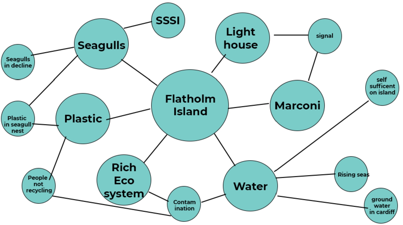
Fig. 1.
General flat Holm island concept map.
4.3.Defining the problem
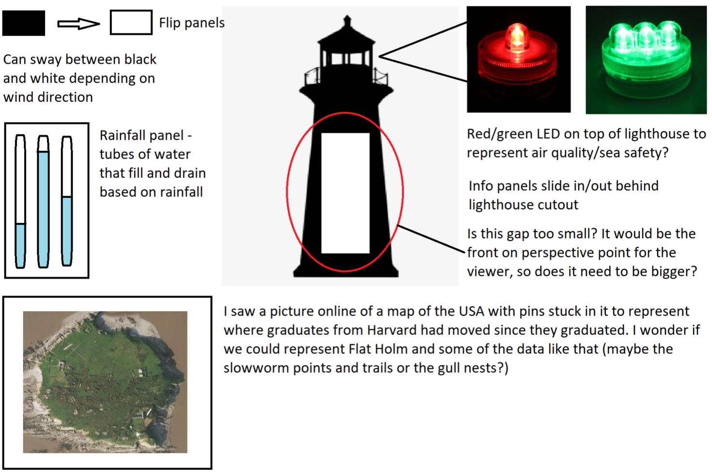
In defining the problem, it was important to consider the various different entities that exist upon the island, as well as parts of its history and its status as a State of Special Scientific Interest (SSSI). Figure 1 shows some of the themes that the team considered whilst building a general concept map of Flat Holm island. Part of this process also involved meeting (virtually) with a number of people who were involved with or had some expert understanding of the key themes. For example, the team met with a specialist of the unusual black headed gull found on Flat Holm and some of the numerous volunteers who help keep track of and monitor the numbers of these species of the island. They also virtually met with the island warden, a harbour master from Cardiff Bay and members of Cardiff Council environmental management team to name just a few. Each of these conversations prompted the team’s thinking around the range of intimately linked and wide-ranging themes. As a team, they sought to tie these themes and connections into meaningful narratives that then might work for the data physicalisation. This kind of ‘concept mapping’ [17, p. 284] led to a great deal of spider diagrams, sketches and visualisations as well as physical models in the early stages of the project. Throughout this process the team focused on identifying the engaging and meaningful communication of key narratives relating to the ecosystem of Flat Holm island. For example stories around gull numbers, breeding and eating habits featured heavily in the early thinking, particularly as the team learnt how the recycling habits of Cardiff’s citizens had a direct impact on where gulls tended to look for food. Rare flora, fauna and insect life also seemed a key narrative from the early stages of the project especially as count data relating to the flora & fauna on the island was made available to the team. The general backdrop of the island with its Victorian military barracks, abandoned Cholera hospital and iconic lighthouse immediately made for an engaging context for these narratives. As shown in Fig. 2, one of the early prominent ideas was a figure of a lighthouse – perhaps the most notable landmark on the island. As lighthouses are generally used to signal danger to those travelling at sea, the team focused on the possibility of using lighting effects at the top of a lighthouse structure to represent conditions such as air quality for example. Some of Flat Holm’s history also offered an appropriate contextual reference of technological advancement for the project as it includes the first ever radio signal being transmitted by Marconi in 1897.
In addition to this, the water of and around Flat Holm island featured in quite a few detailed discussions. Some of the thinking was around how the habits of Cardiff’s citizens can impact the water story with factors such as pollution through industrialisation and litter ending up in the water as it flows from inland on the mainland, to the Bristol channel surrounding Flat Holm. Concept mapping helped formulate thinking around the value of water, and sustainability particularly as the team learnt that although the island was surrounded by water, the island warden and other occasional inhabitants can at times consider it to be in short supply, relying as they do on collection of rain water for domestic use. In view of how it is common to take water for granted, we became keen to explore themes relating to the value, availability and possible sources of water in our data physicalisation.
Fig. 2.
Flat Holm lighthouse sketch.
4.4.Generating ideas
One of the challenges of the project was the bringing together / strengthening of the contextual narratives with the appropriate data streams to create a data physicalisation that afforded engaging data impressions. Story boarding, a common technique in human computer interaction (HCI) and related systems design (see [34, p. 12]), was a useful tool here. It was an effective way to envisage how the narratives might be told and the data depicted in a congruent and meaningful way that does justice to data accuracy whilst also capturing an engaging impression of the data.
As the ideas evolved two key data physicalisation outcomes emerged. The first of these was a mechanical weather automata. This was a series of rotating prisms that allow for the physical compiling, manipulation and animation of surface textures and images in relation to weather data streams from Flat Holm (see Figs 3a, 3b and 3c). The team developed three physicalisations, one for rain, sun and wind data. These kinetic display boards echo the formal qualities of lighthouse Fresnel lenses, the technological development in lighthouse optics that dates from the early 1800s. With their kinetic rotation, the pieces also have the quality of vintage electromechanical display boards which in our current screen saturated world the team hoped would appear engaging and unusual to a younger (and older) audience. With the use of reflective material on the faces of the rotating prisms, the patterns and optical rhythms which the team created with this outcome generated hypnotising data impressions of weather patterns. In addition to this the prismatic displays are designed to sit above a narrative sceneography of Flat Holm where audience members will be able to make the connection between the weather, and life on the island.
Fig. 3.
Weather automata prototypes.
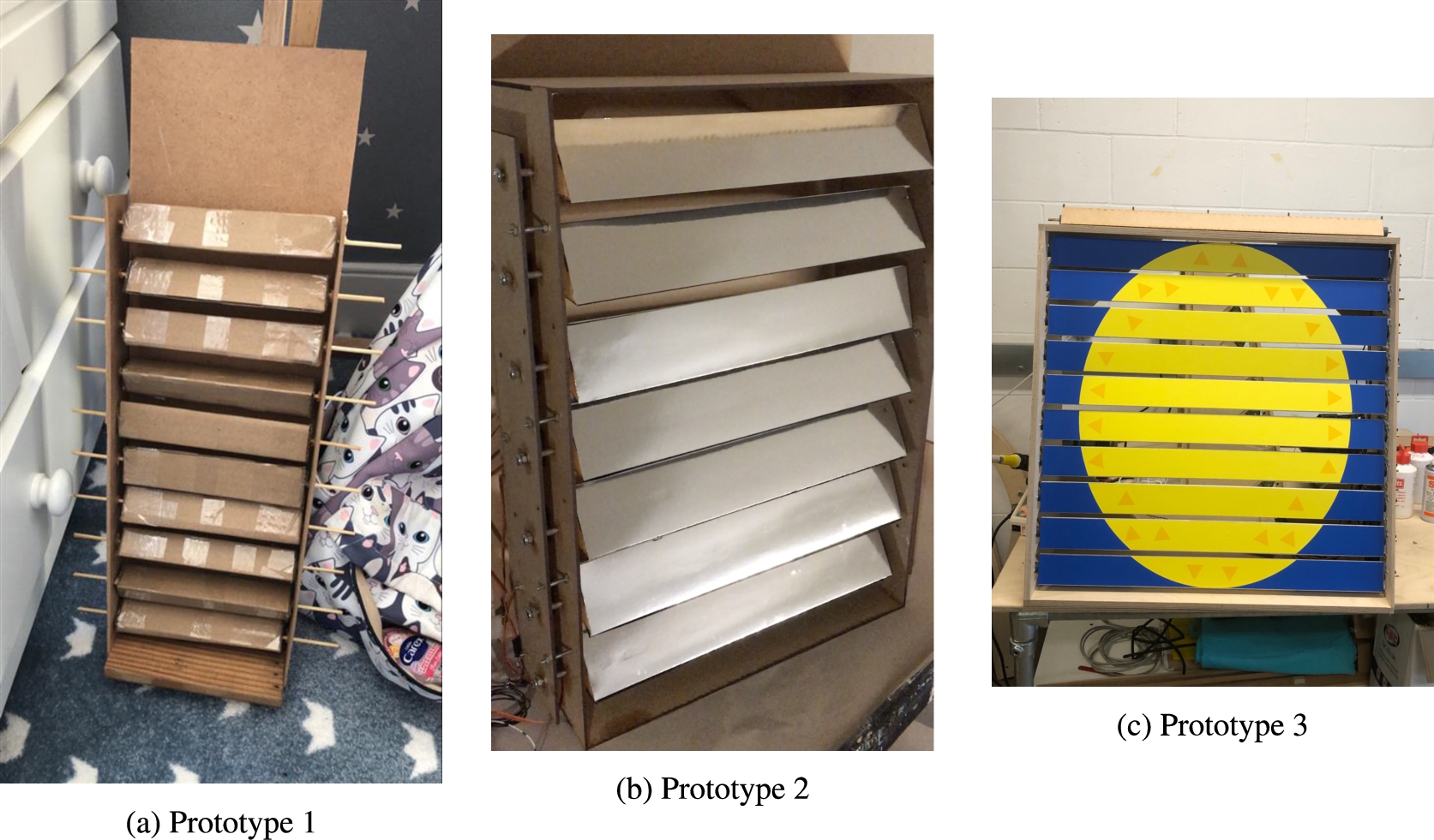
Fig. 4.
Interactive Daptec map prototypes.
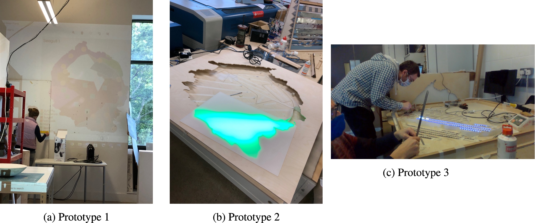
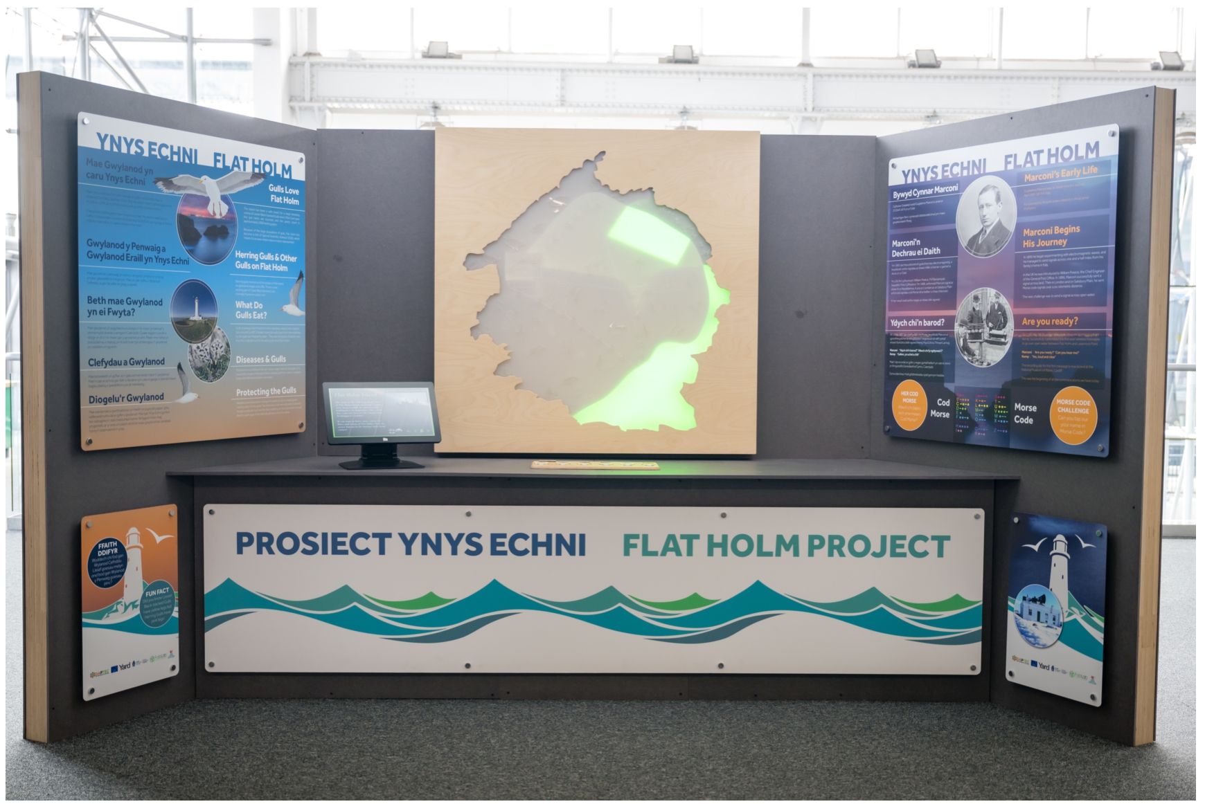
The second main line of enquiry that emerged was a large back lit interactive map of the island (using Neopixel multicoloured LEDs, see Fig. 4a) in combination with a series of proximity sensitive interactive props representing different species specific to Flat Holm including the black headed gull and wild leek. The idea here was that the audience would be able to move to the proximity of a particular prop (a gull for example) and see the number and distribution of that species around the island,. One key element of the project that has been developed to support this has been an app that the island warden can use to input the latest count of different species on a regular basis. A touchscreen informative stand has also been designed to provide the audience with some further information about the flora and fauna and their lives on the island.
We have also been keen to integrate and represent the human activity on the island as another ‘species’ and to this end we have explored the island warden’s log book entries. A longer term ambition of the project, beyond this data physicalisation phase, is to experiment with text and sentiment analysis of the log books.
4.5.Building prototypes
Prototyping has been crucial to the design and development of the data physicalisation, showing what might or might not work, as well as providing opportunities for new and/or evolved ideas. Several prototypes of the data physicalisation were created during different stages of the Daptec Flat Holm project (see Figs 3 and 4). Generally a prototype is understood to be an initial model of a product that is used to communicate to others what the final product may ‘look like...behave like...work like’ [3, p. 424]. On this project, prototypes were used to demonstrate aspects of the physicalisation, partial ideas as well as the more complete experience. In terms of the interactive Daptec map, we can see how the artefacts evolved from quick low fidelity prototypes projected on to the wall to medium and higher fidelity prototypes (see Fig. 4a, Fig. 4b and Fig. 4c). A low fidelity prototype is ‘a prototype which is simple and whose development does not need very much time’ and ‘may be developed using paper and other ‘low fidelity-materials’ [30, p. 778]. This sort of prototyping is very quick and easy to make, possible to make at home (especially, as the team were not able to access university fabrication facilities in the early stages of the project due to Covid-19 restrictions). The low fidelity prototypes provided the team with a physical representation of the data physicalisation for conceptual refinement and improvement. By making these low fidelity prototypes (see Figs 3a and 4a), the team found it easy to see how elements fitted together and to note what may have to be iterated upon for future prototypes. The team found it very effective to make these early, simple mock-ups of the data physicalisation using cheap, easy to get materials. In many instances, precious resources were not wasted and ideas were successfully teased out and shared. As the design stages evolved, more higher fidelity and more complex prototypes were developed as shown in Fig. 3c and Fig. 4c. These began to introduce some of the possible electronic techniques that now feature in the final data physicalisation such as LED lighting systems and touch interaction (see Figs 5 and 6).
4.6.Exhibit fabrication and data
As can be seen in Figs 3c, 4b, 5 and 6 the final approaches developed for the Techniquest exhibit grew from the lines of enquiry and prototypes described above. These were the mechanical rotating prism displays for representing weather data (weather automata) and the back lit map for representing species counts on the island. Both exhibits were developed and fabricated in Cardiff Fab Lab at Cardiff Metroplitan University as soon as Covid restrictions allowed access. The final exhibition artifacts were fabricated using a range of digital fabrication methods (CNC routing, laser cutting, vinyl cutting), open source embedded computing and electronics techniques, and were finished and assembled by hand.
Fig. 5.
Weather automata final exhibit.
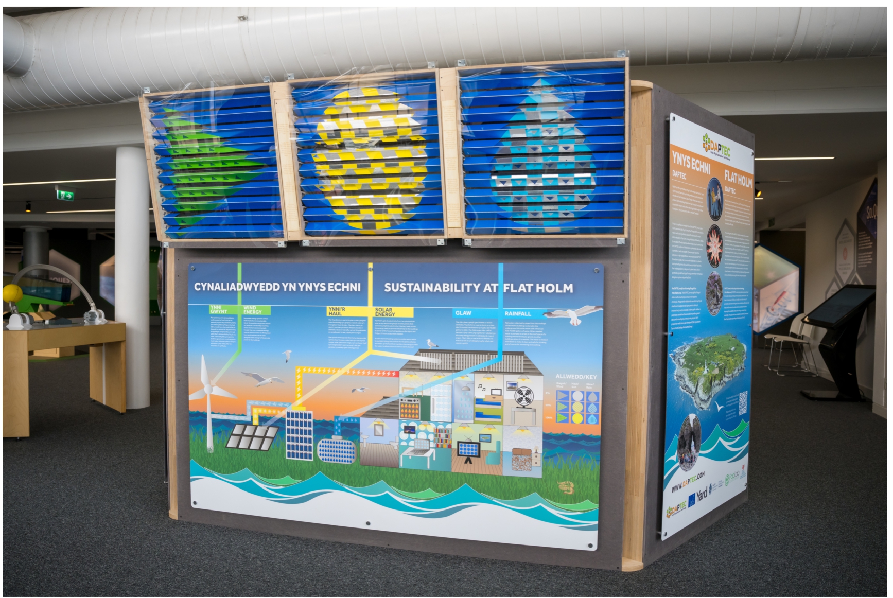
Fig. 6.
Interactive map final exhibit.
In the Techniquest exhibition, the weather automata is connected directly to a server hosted by industrial project partner Yard Ltd. which receives regular updates from a remote weather station situated on Flat Holm. The weather data (wind, rain and sun index) is normalised to a range of 0 to 10 and sent to the three corresponding automata units (see Fig. 5) which then adjust the rotational position of the prisms accordingly to represent the associated data stream. With a sun, a rain drop and a wind arrow as the main graphic shapes, the different faces of the prisms show either a solid colour (data value of 1), a mirror surface (data value of 0) or a checkered mirror/colour face (value of 0.5) for each of the 10 prisms. Between the static data representations the displays enact a range of transitional behaviours where the reflective surfaces cause physical, optical effects, creating evolving geometries and a play of light. This helps to create the ‘data impression’, an aesthetically engaging and exciting play of visual, physical behaviours that draw an audience in with the aim of providing an overall sense of the current weather on the island.
The back-lit map of the island is designed to represent data on the various species particular to Flat Holm as described above. The species are generally found and counted in particular areas of the island and as such the map is divided into these areas by using light blocking paper material between otherwise diffuse back lighting. This gives an engaging visual effect which combines both highly diffuse colour fields and ‘hard edge’ boarders behind a frosted acrylic map the surface of which has been etched with key cartographic elements of the island (paths, lighthouse etc.). A top layer of clear acrylic cut out icons of the various species being represented adds to the rich dynamic and multi-layered representation and impression of the island and its species. A touch interactive panel allows for the audience to dial up a species and see their representation on the map where the brightness, dynamic movement and density of light will represent species count data. This final link between the custom app (i.e. data collection tool) developed for species count data on the island, and the interactive map in Techniquest has – at the time of writing- yet to be made fully, though the prototype system on exhibition does represent the location of where the island warden and volunteers make the species counts. A longer term aspiration of this prototype is that the map will sweep through a historical set of data before finishing at the latest up-to-date count of a given species. As good quality data is accrued over a number of years via the app, this will show the dynamic rise and fall of species through seasons and years.
The final stages of development of the work for Techniquest focused on making these final prototypes robust enough for public exhibition. This was no easy challenge particularly as a good deal of the audience are children with a tendency to touch and even climb on exhibits. This is mentioned here as it is a concern for any smart city technology particularly if placed in a public arena, that it is robust enough to ensure a long lasting and meaningful interaction with data.
5.Early iterative testing
The early testing of the Daptec concepts and prototypes took part in several iterative studies. One of these studies was conducted as an online focus group on the tenth of November 2021. Fifteen females between the ages of five to seven years (one of the target age groups) took part in the study. The main aim was to get some insight into participants’ engagement with concepts for the data physicalisation and the data impressions. The Ethics Board of Cardiff Met approved the studies and participants provided written consent for study completion and the academic use of de-identified data. The following is a short summary of some of the main thoughts that emerged during this study. In terms of the interactive Daptec map, the participants were fascinated by the potential of the multi-sensory and complimenting the visual with the audial interaction (i.e. the fluttering noise for butterflies). They also felt that it could be really engaging to have a paper worksheet (on entering the exhibition site) where they could be given the job (like the warden on the island) to count all the Flora and Fauna using the map etc. For the weather automata, the visual, tactile and audio interaction came to the forefront again. The participants discussed ideas around having a tactile – heater, sprayer, fan to simulate wind and rain, they also mentioned cotton wool clouds and having lights behind the cotton wool. They discussed an idea of a rainbow and raindrops – changing colour (blue, pink, yellow, grey). The sun was clearly noted as needing to be golden and yellow. They clearly shared that the wind automata needed to portray a sideways wind motion and realistic cloud movement. In conclusion, some interesting ideas emerged during this study. The audial interaction is something that was not fully investigated for this project however a lot of the visual ideas were explored/ applied in the final exhibit (see Figs 5 and 6). The final user evaluation of the Daptec Flat Holm exhibit is scheduled for May and June 2022.
6.Discussion
Managing progress, expectations and direction of a multidisciplinary team was an interesting challenge for the Daptec Flat Holm project and one that the team felt has led to an enhancement of the creative design process. In detail, the team designing the data physicalisation consisted of artists, engineers, data scientists, creative technologists and interaction designers among other specialisms. Frazzetto [10, p. 233] states that ‘whereas science corresponds to progress, methodical rationality, austerity and objectivism, art is recognized as mysterious creativity, ambiguity and joyful idiosyncrasy’ and this sense of difference in disciplinary approach has very clearly surfaced within the project leading the team to some of the novel guiding principles discussed here.
Further to this, some interesting and unexpected issues and questions have arisen. One such example is the question of what approach should a project like ours take when the data is ‘boring’, as in unchanging, flat devoid of any narrative? This has become a key question for the Daptec team and one that the team feels could reflect on other projects working with/ tasked with the visualisation and physicalisation of uneventful data. The question touches on the primary site of their creative and technical efforts and points to the space where ‘hard’ scientific data gets made into a human narrative or experience. The team grappled with this problem for several weeks and through lots of discussions and sketches. Eventually, the idea of data being accurate but not presented in precise detail emerged, hence the coining of the term ‘data impression’. With this, a new wave of thinking and understanding entered the project paving the way for both the scientist and the artist in each of the team members to come together to design and create an engaging yet authentic data physicalisation. It has enabled the team to aesthetically appeal to an audience whilst also to convey the data narrative in an authentic and memorable way. With data impressionism, the data physicalisation isn’t so abstract that the data story is lost, unauthentic or undecipherable. Neither is it too rigid in its display of the data that every microscopic detail has to be presented. The concept of the data impression is driving the design for responsible innovations in how it strikes a balance between the science and art to creatively engage the end users in the environmental narrative of the island.
Likewise the practice of using slow data can play its part in the design of the responsible data physicalisation. Indeed, it is no outlandish claim to state that technology is the way forward in terms of solving global issues such as climate change. The ever evolving fields of responsible innovation and green computing shall serve to not only highlight the issues facing our planet but also to raise awareness and even come up with the means to further help the planet to heal. By combining the science and the art, the team has found that creative link to convey complex environmental messages in an accessible but authentic way. In more detail, the environmental story of Flat Holm island portrayed by the data physicalisation will hopefully give a much needed spotlight to a SSSI that is overlooked and even unheard of by some of Cardiff’s citizens. It is important that, through the use of the data physicalisation, the team engages people in the local Flat Holm story but in doing so highlights the bigger global environmental narrative. With key prototypes now operational much of the current work can now turn to such questions with consideration of the end users, impression and energy efficiency all in mind.
7.Conclusion
Sustainability, climate change and global warming are some of the toughest problems humanity faces today. They have become such big problems that it now needs cities across the world to unite and work together to combat it. To achieve this, the world needs to reduce its carbon footprint. This might not be as easy as it seems especially as we have evolved into a ‘Fourth Industrial Revolution’ way of working and existing, where technologies emerge and affect our lives and worlds in ways that we never thought they could. Indeed, as technology evolves so does our use and dependence on technology, but technology doesn’t need to be the problem, it can also provide the solution. As we have seen this paper maps out the detailed and often complex design thinking journey of a responsible data physicalisation innovation to explore and determine how we might engage people in a greater awareness of their environment and it’s needs. By intricately combining the creative and science worlds, the Daptec team have explored the development of a data impression as a new way to engage Cardiff citizens in their local environmental story. Indeed, the team feel that the data impression which prioritises the capturing of a data moment over complex compositions of hard facts will engage more with the actual living experience of Cardiff citizens. As opposed to the authoritatively imposed strings of complex environmental graphs and statistics. The next steps for the team will be to undertake a series of user experience evaluations. This will be to fully understand how people of Cardiff are actually experiencing the data impressions and if they are feeling more engaged with the sustainability and biodiversity narrative of Flat Holm island. Choenni et al. [7] note smart cities and societies are needing to seek ways to exploit vast amounts of data. We are hoping that approaches like the data impression could provide valuable ways to engage the data fatigued citizens into wanting to play their part. To want to adapt, even change their current behaviours and ultimately make a difference with more awareness and environmentally friendly practices.
Acknowledgements
This research was funded by the Welsh Government Smart Expertise (European Regional Development Fund). We are very grateful to: industrial partners Yard Ltd., Cardiff Council and Natural Resource Wales. Also, Andrzej Bak who developed the data collection tool for the project and Fab Lab Cardiff who helped with the project fabrication. Finally, Techniquest Science Museum, Cardiff who are hosting the data physicalisation exhibit.
Conflict of interest
None to report.
References
[1] | K. Bijsterveld, Sonic skills: Listening for knowledge in science, medicine and engineering (1920s-Present), 2018. |
[2] | K. Bruynseels, When nature goes digital: routes for responsible innovation, Journal of Responsible Innovation (2020). doi:10.1080/23299460.2020.1771144. |
[3] | M. Buchenau and J.F. Suri, Experience Prototyping (2000), https://dl.acm.org/doi/10.1145/347642.347802. |
[4] | W.A. Bullough, K. Worden and J. Haywood, Smart Technologies, (2003) , https://ebookcentral.proquest.com/lib/cardiffmet/reader.action?docID=1681719. |
[5] | CambridgeEnglishDictionary, DATA (2021). https://dictionary.cambridge.org/dictionary/english/data. |
[6] | M. Chabot, L. Delaware, S. McCarley, C. Little, A. Nye and E. Anderson, Living in Place: The Impact of Smart Technology, (2019) . doi:10.1007/s13670-019-00296-4. |
[7] | S. Choenni, M.S. Bargh, T. Busker and N. Netten, Data governance in smart cities: Challenges and solution directions, Journal of Smart Cities and Society 1: ((2022) ). doi:10.3233/SCS-210119. |
[8] | M. Cohn, User Stories Applied from the Library of www.wowebook.com, (2004) , www.wowebook.com. ISBN 0321413091. |
[9] | M. Dorfman, in: Requirements Engineering, (2011) , pp. 7–22. doi:10.1109/9781118156674.ch1. |
[10] | G. Frazzetto, Different and yet alike, EMBO Reports 5: (3) ((2004) ), 233–235. doi:10.1038/sj.embor.7400103. |
[11] | M. Geddes, Slow Data Versus Quick Data, (2013) , http://www.martingeddes.com/wp-content/uploads/Geddes-Slow-Data-versus-Quick-Data.pdf. |
[12] | J.J. Häußermann and F. Schroth, Aligning Innovation and Ethics: an Approach to Responsible Innovation Based on Preference Learning, Philosophy of Management (2020). doi:10.1007/s40926-019-00120-1. |
[13] | R.J. Hernandez and J. Goñi, Responsible design for sustainable innovation: Towards an extended design process, Processes (2020). doi:10.3390/pr8121574. |
[14] | T. Hogan, Data sensification: Beyond representation modality, toward encoding data in experience, in: DRS2018: Catalyst, (2018) . doi:10.21606/drs.2018.238. |
[15] | S.E. Jakobsen, A. Fløysand and J. Overton, Expanding the field of Responsible Research and Innovation, (RRI) – from responsible research to responsible innovation (2019). doi:10.1080/09654313.2019.1667617. |
[16] | Y. Jansen, P. Dragicevic, P. Isenberg, J. Alexander, A. Karnik, J. Kildal, S. Subramanian and K. Hornbaek, Opportunities and Challenges for Data Physicalization, (2015) , https://hal.inria.fr/hal-01120152. ISBN 9781450331456. doi:10.1145/2702123.2702180. |
[17] | M. Kane, W. Michael and K. Trochim, Concept mapping for planning and evaluation, ProQuest (2007), https://search.proquest.com/openview/89ee9a276ae4f1786405b5e3a2e16235/1?pq-origsite=gscholar&cbl=38879. |
[18] | Y.T. Ko, Modeling an innovative green design method for sustainable products, Sustainability (Switzerland) (2020). doi:10.3390/su12083351. |
[19] | W. Lang and J.M. Patel, Towards eco-friendly database management systems, in: CIDR 2009 – 4th Biennal Conference on Innovative Data Systems Research, (2009) . |
[20] | A.M. Levenda, Thinking critically about smart city experimentation: entrepreneurialism and responsibilization in urban living labs, Local Environment (2019). doi:10.1080/13549839.2019.1598957. |
[21] | Z. Liu, L. Ma, Y. Zhu and W. Ji, An investigation on responsible innovation in the emerging shared bicycle industry: Case study of a Chinese firm, Journal of Open Innovation: Technology, Market, and Complexity (2019). doi:10.3390/joitmc5030042. |
[22] | T.B. Long, V. Blok, S. Dorrestijn and P. Macnaghten, The design and testing of a tool for developing responsible innovation in start-up enterprises, Journal of Responsible Innovation (2020). doi:10.1080/23299460.2019.1608785. |
[23] | P. Madge, Design, ecology, technology: A historiographical review, Journal of Design History 6: (3) ((1993) ), 149–166. http://www.jstor.org/stable/1316005. doi:10.1093/jdh/6.3.149. |
[24] | M.L. Masurier, A manifesto for slow media, Journal of Communication ((2019) ). doi:10.1093/joc/jqz008. |
[25] | N.E. Matthews, L. Stamford and P. Shapira, Aligning sustainability assessment with responsible research and innovation: Towards a framework for Constructive Sustainability Assessment, Sustainable Production and Consumption (2019). doi:10.1016/j.spc.2019.05.002. |
[26] | S. Murugesan, Inside Greening Unwanted Computers: The Three Rs Green IT Standards and Regulations Green IT Resources Harnessing Green IT: Principles and Practices Adopting a holistic approach to greening IT is our responsibility toward creating a more sustaining environment, 2008, http://egj.lib.uidaho.edu/index. |
[27] | D. Nelson, What Is Real-Time Processing? (2011) , (with picture), https://www.easytechjunkie.com/what-is-real-time-processing.htm. |
[28] | S.L. Pimm, S. Alibhai, R. Bergl, A. Dehgan, C. Giri, Z. Jewell, L. Joppa, R. Kays and S. Loarie, Emerging Technologies to Conserve Biodiversity, (2015) . doi:10.1016/j.tree.2015.08.008. |
[29] | D.C. Rose and J. Chilvers, Agriculture 4.0: Broadening Responsible Innovation in an Era of Smart Farming, Frontiers in Sustainable Food Systems (2018). doi:10.3389/fsufs.2018.00087. |
[30] | R. Sefelin, M. Tscheligi and V. Giller, Paper Prototyping – What is it good for? A Comparison of Paper- and Computer-based Low-fidelity Prototyping, 2003. |
[31] | H. Song, R. Srinivasan, T. Sookoor and S. Jeschke, Smart Cities: Foundations, Principles, and Applications, (2017) , https://ebookcentral.proquest.com/lib/cardiffmet/reader.action?docID=4883016. |
[32] | Soso, CSIS Data Chandelier (2021). https://www.sosolimited.com/work/csis-data-chandelier/. |
[33] | M. Talha, N. Elmarzouqi and A. Abou El Kalam, Towards a powerful solution for data accuracy assessment in the big data context, International Journal of Advanced Computer Science and Applications (2020). doi:10.14569/ijacsa.2020.0110254. |
[34] | K.N. Truong, G.R. Hayes and G.D. Abowd, Storyboarding: An Empirical Determination of Best Practices and Effective Guidelines, (2006) . |
[35] | J.C. Tu and H.S. Huang, Analysis on the relationship between green accounting and green design for enterprises, Sustainability (Switzerland) (2015). doi:10.3390/su7056264. |
[36] | UKGovernment, The National Archives, the National Archives, (2022) , https://www.nationalarchives.gov.uk/. |
[37] | I. van de Poel and M. Sand, Varieties of responsibility: two problems of responsible innovation, Synthese (2018). doi:10.1007/s11229-018-01951-7. |
[38] | V. Varžinskas, Z. Markeviciute, I. Kazulytė, V. Grigolaitė and V. Daugelaitė, Eco-design methods and tools: An overview and applicability to packaging, Environmental Research, Engineering and Management (2020). doi:10.5755/j01.erem.76.4.27448. |
[39] | C. Voegtlin and A.G. Scherer, Responsible Innovation and the Innovation of Responsibility: Governing Sustainable Development in a Globalized World, Journal of Business Ethics (2017). doi:10.1007/s10551-015-2769-z. |
[40] | T. Zheng, G. Chen, X. Wang, C. Chen, X. Wang and S. Luo, Real-time intelligent big data processing: technology, platform, and applications, Science China Information Sciences (2019). doi:10.1007/s11432-018-9834-8. |