
How readers discover content in scholarly publications
Abstract
Scholarly journal publishers have concerned themselves for many years with their delivery platforms and their feature sets, but have spent rather less time on considering how their content will be discovered. Traditionally there has been an over-reliance on major search engines and leading professional indexes. For the past ten years we have continually surveyed and studied the landscape of journal article discovery, culminating in a large scale survey (
1.Introduction
The discovery of journal content is complex, with a range of discovery methods available for most resources. Historically, journal articles tended to be available on a limited number of platforms, usually the publisher’s official web site and any sanctioned aggregation of its content, such as EBSCO and ProQuest collections. However, further incarnations of articles are increasingly discoverable in institutional repositories, subject repositories (especially PubMedCentral), as well as a range of other sites including ResearchGate, Academia.edu, and Mendeley. This has further complicated discovery since (at the time of writing) no single discovery service indexes all of these incarnations, and no single discovery service seems to index at least one incarnation of all of the content available. This limitation is partly one of business relationships, partly a lack of understanding of metadata distribution, and sometimes political constraints.
The diagram below shows some of the paths open to a selection of reader types in discovering journal content online, and demonstrates the complexity of reader navigation.
Fig. 1.
Some of the paths in reader navigation and discovery.
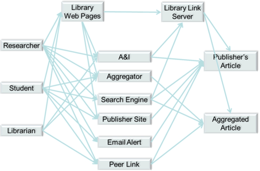
Libraries provide two layers of navigation, although these layers are increasingly indistinguishable to the reader. Library web pages are a discovery tool in their own right and range from simple catalogue listings of titles right through to advanced resource discovery solutions (RDS). In addition, though, there is the library link server (or link resolver), which is often configured to intermediate traffic from many other discovery resources and route the reader through to the most appropriate incarnation of the content (usually the subscribed-to incarnation) for the reader. For more advanced libraries, this can be remarkably powerful, intermediating traffic not only from library web pages and abstracting & indexing services (A&Is), but also from mainstream search engines, a feat sometimes achieved through careful programming of the institutional proxy or gateway. Google Scholar, as a specialist scholarly search engine, allows individuals to save institutional link server details as part of their preferences, thus revealing additional, library-intermediated pathways to content directly from the search results page (see configuration of library link server in Google Scholar preferences at https://scholar.google.co.uk/scholar_settings?sciifh=1&as_sdt=0,5#2).
However, library discovery, in fact most discovery channels, have failed to keep pace with the rise of mobile devices in journal discovery, especially smartphones. Publishers continue to invest in mobile delivery (and fully-responsive web sites), but the discovery layers are failing to keep pace. This may drive more readers to use publisher web sites directly for discovery, something librarians generally discourage, as by definition this restricts the breadth of search undertaken.
Of the great variety of pathways (examples of which are illustrated in Fig. 1 above) that readers utilise to discover content, usage statistics and web analytics can reveal some of this navigation. From the publisher’s point of view, it will know how much use was made of its own content by each institution, but most likely will not know the reader demographic within that institution e.g. job role. The publisher will also know something of which of the discovery platforms the reader has arrived from, and also knows the institutional breakdown of usage of any aggregated databases. Currently, the publisher uses this limited knowledge to help show value to its clients and also to inform the design of its web site. Given the needs of its paying clients (the libraries), publishers need to know more about this navigational behaviour.
The library knows more of the individual’s identity, and has the potential to know a lot about discovery platforms as long as the reader navigates to the content via a link resolver. However, the library doesn’t know about the complexities of navigation for those who operate outside of the library-intermediated environment; however, the library will get usage data from publishers, but this is not married-up with a reader profile. There is an increasing need for libraries to be able to demonstrate value of e-resources. In its simplest form this is usage, but more advanced analysis relies on understanding which job roles were responsible for each type of usage, and in the final analysis, libraries need to be able to show evidence of a positive outcome in return for acquisition of information products.
This research aims to fill some of these knowledge gaps by surveying what readers believe their actions in discovery to be.
2.Headline findings
As a starting point for search, A&Is seem to be in a slight decline when looked at in aggregate across all regions and sectors, but remain the most important.
Academic researchers in high-income countries now rate library discovery as highly as A&Is, and rate academic search engines as the most important discovery resource when searching for journal articles.
Library discovery services have made significant advances in importance in search for academic researchers, and for all roles in hard sciences in the academic sector. As an average across all subjects and sectors, however, they have not grown in importance in since 2012.
More than half of all journal content delivery appears to be from free incarnations of articles. There appears to be a clear PubMedCentral effect in the medical sector. Social media sites appear to be a significant source of free articles in lower income countries.
In academic STM in higher-income countries, academic search engines are now more important than general search engines.
Table of Contents alerts have reduced in popularity in all measures across the survey.
There appears to be an increased role for social media in discovery.
Publisher web sites are becoming more popular as a search resource, although this is less true for people in wealthier countries.
Google Scholar is used more than Google in the academic sector, but less than Google in all other sectors.
A perceived lack of awareness of Google Scholar in poorer nations appears to be leading to a reduced use of free incarnations of content in institutional repositories from these regions.
3.Search
One of the big questions it is very hard to answer with just analytics is where people start their search when they are looking for journal articles – analytics will only tell you which resource people came to your site from and not where they started on their journey. Only by understanding where people start will publishers be able to ensure that their content distribution priorities are in order, and will librarians be able to ensure they are helping their patrons on their journey of discovery. There are many variances in the search behaviour of people by sector, region, job type and subject discipline, and to date the only practical way to get a true understanding of their chosen discovery resources is to ask them. Given that we have been asking this question of researchers, students, information professionals, lecturers and others over the last ten years, we are able to show how search behaviour has changed over time.
It is important to note that the results from 2012 and 2015 have been normalised to match the demographic sample of 2005 and 2008 (see Section 7). Therefore, these ten-year results show the responses predominantly from researchers working within STM subjects, in academia, in the US and Europe, see Fig. 2.
Fig. 2.
Trend Analysis: Journal Article Search: 2005–2015.
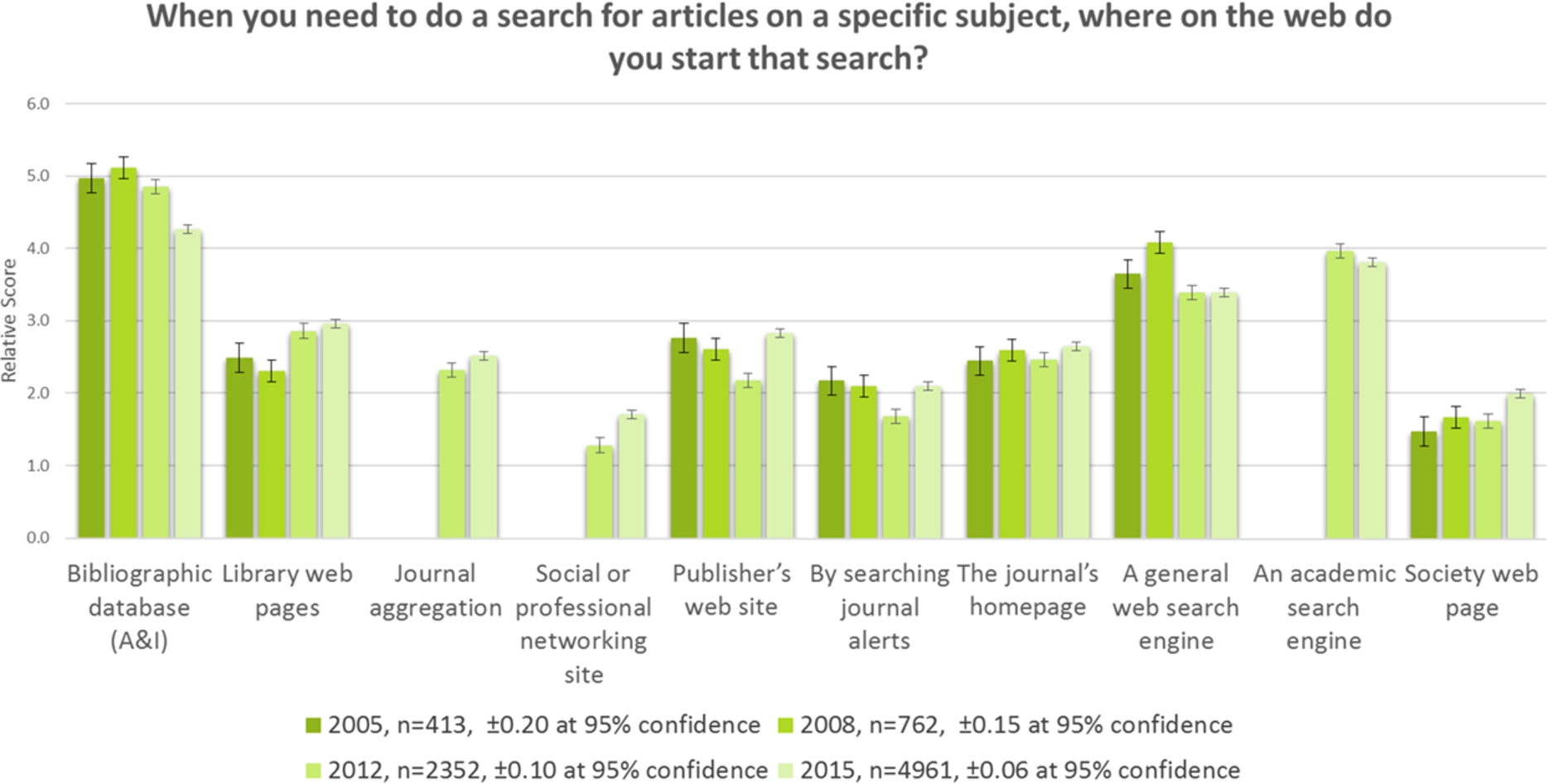
A key result is that whilst A&Is (such as Scopus, Web of Science, PubMed) are still marginally the most important search resource, their importance has consistently dropped since 2008. General search engines (like Google and Yahoo) have lost some ground here to academic search engines (such as Google Scholar).
Library discovery (the library web site and library-integrated RDS services combined) became more important for search in 2012 and has stayed steady since then. This may be seen as a disappointing result for libraries, who continue to invest in their resource discovery technologies.
There has been growth in the importance of journal aggregations (such as EBSCO and ProQuest) and social media for search.
All search resources that are under publisher control – publisher website, journal alerts, journal homepage, and society webpage – have made gains. This may go contrary to what we believe to be logical behaviour, since no one publisher site provides an index to all the relevant content in a subject area. We see from our results that librarians themselves avoid this behaviour, and presumably advise their patrons against it too. However, these results seem to show that more people are willing to use a publisher site for discovery and then presumably repeat that on another publisher site, and again for a number of relevant publishers.
In the past, academic researchers working in Life Sciences have told us that A&Is, particularly PubMed, are their key discovery resource type. We wanted to see if this had changed since 2012. Figure 3 shows the results for search behaviour for life scientists in academia working in high income countries. We used a sample from high-income countries only to reduce the chance of funding limitations biasing the results.
Fig. 3.
Search, academic sector life scientists, high-income 2012–2015.
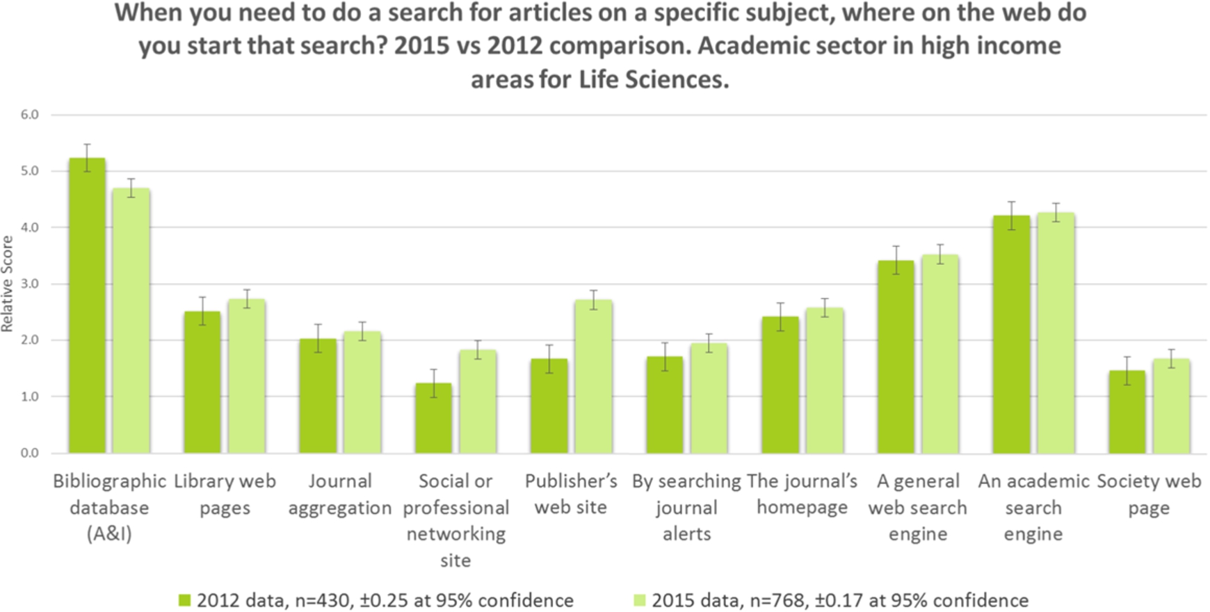
A&Is show a slight decline, but remain the most important resource. There have been significant gains in popularity of social and professional networking sites and the publisher’s web site. A&Is have possibly lost out to social media and the publisher websites. Whilst the chart above only illustrates the results from high-income countries, we have found that the same picture emerges regardless of income classification.
This growth in importance of publisher web sites in search could be because publisher websites have improved, because publisher marketing has improved, the relationship with the end user has improved (including engagement through social media) or because people have become frustrated with other discovery resources.
Fig. 4.
Search, academic researcher, 2012–2015.
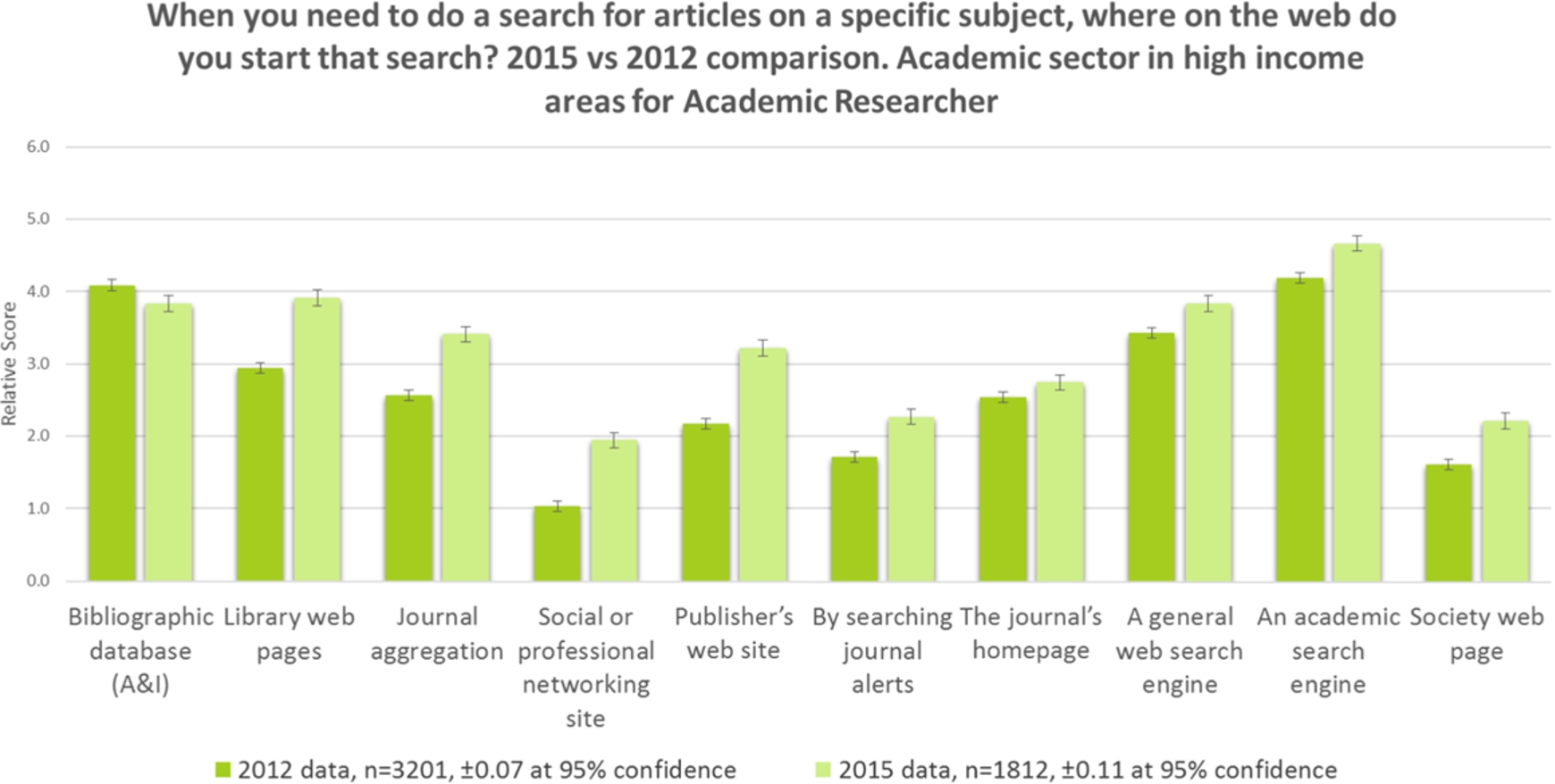
Figure 4 shows that whilst A&Is are still important to academic researchers, all other discovery resources have seen growth, indicating this group is branching out across alternative search resources. Academic search engines have now overtaken A&Is, and library web pages are now as important as A&Is to this group which shows a significant trend upwards in the importance of library technology. Is this because libraries are doing a much better job of encouraging their more senior patrons to use the library website? Likewise, journal aggregations, publisher websites, and social media sites have grown significantly in importance for academic researchers – perhaps this group have become more aware of resources in general over the last three years.
4.Search by region
There are significant regional differences in the importance of search resources, see Fig. 5. People in Asia, Africa, and South America think publisher websites have a similar level of importance to search engines and we can see that people in Europe and North America think they are far less important. People in Africa and Asia still appear to value ToC alerts as a search resource.
Fig. 5.
Search, by region, 2015.
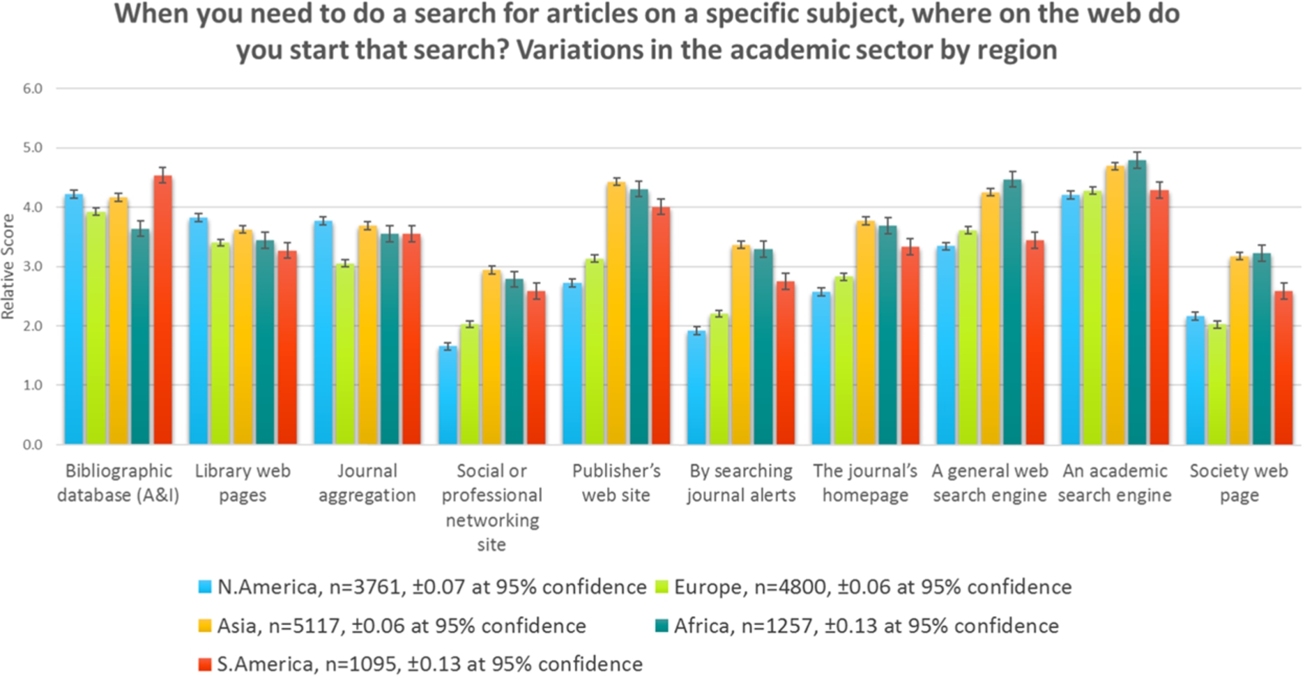
A&Is are the most important search resource to people in South America.
A&Is are slightly more important to people in lower/middle income countries. Poorer countries are more reliant on free search resources. There is a significant difference in the ranking of social media sites as a search resource between high- and low-income countries.
5.Search engine preference
Figure 6 shows us that it is only in the academic sector where journal readers use Google Scholar more than they do Google. It should be noted that in previous questions we asked respondents to indicate how important each starting point was to them, whereas here we have asked them about the frequency of use. Consequently, the relative differences between Google and Google Scholar may be slightly different to the earlier findings, although the earlier questions will have been effectively a sum of the academic versus the non-academic search engines above. The corporate sector makes the least use of Google Scholar, and this may be an awareness issue.
Fig. 6.
Search engines, high-income countries, by sector, 2015.
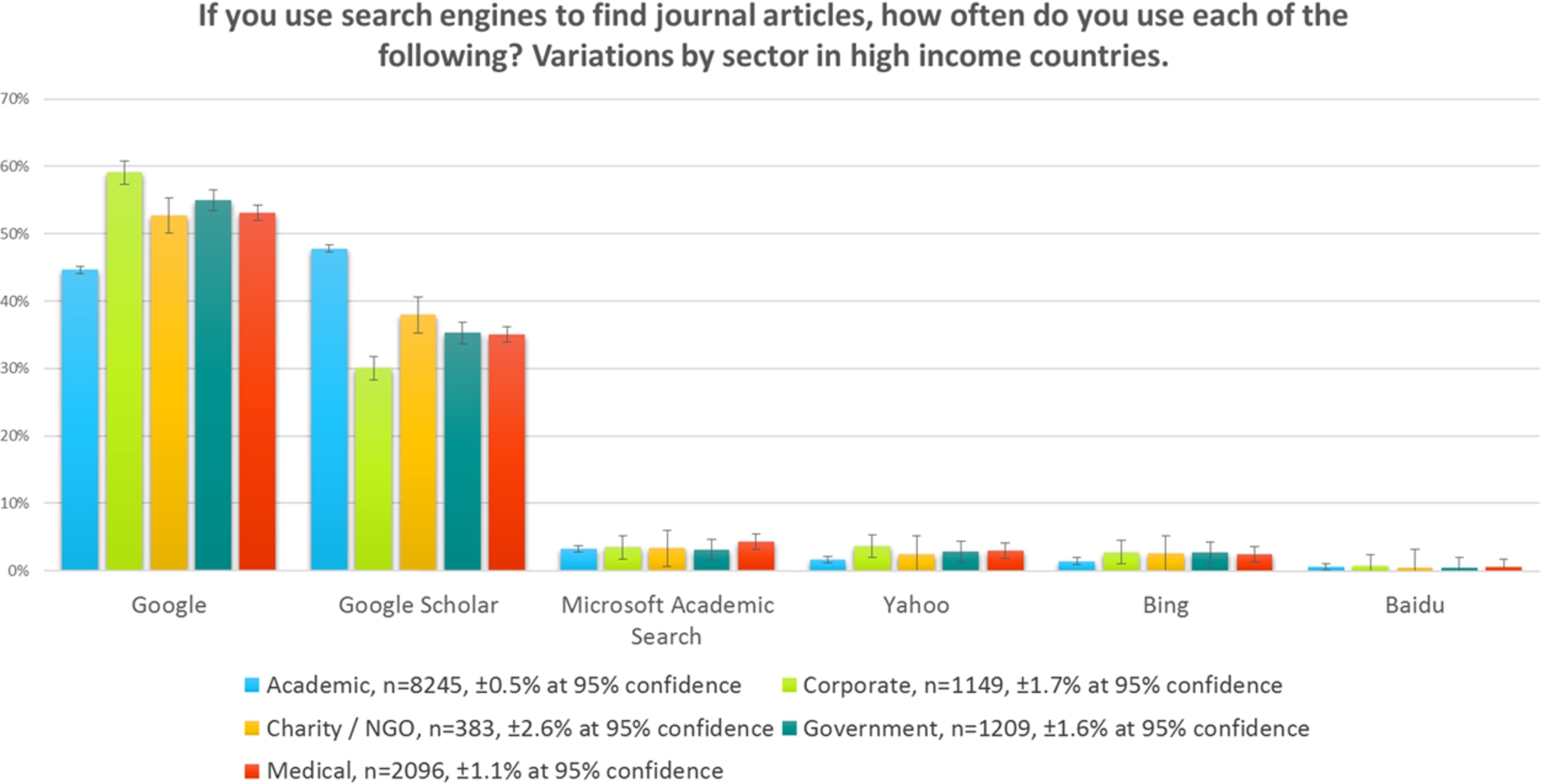
Fig. 7.
Search engines, academic sector, by country, 2015.
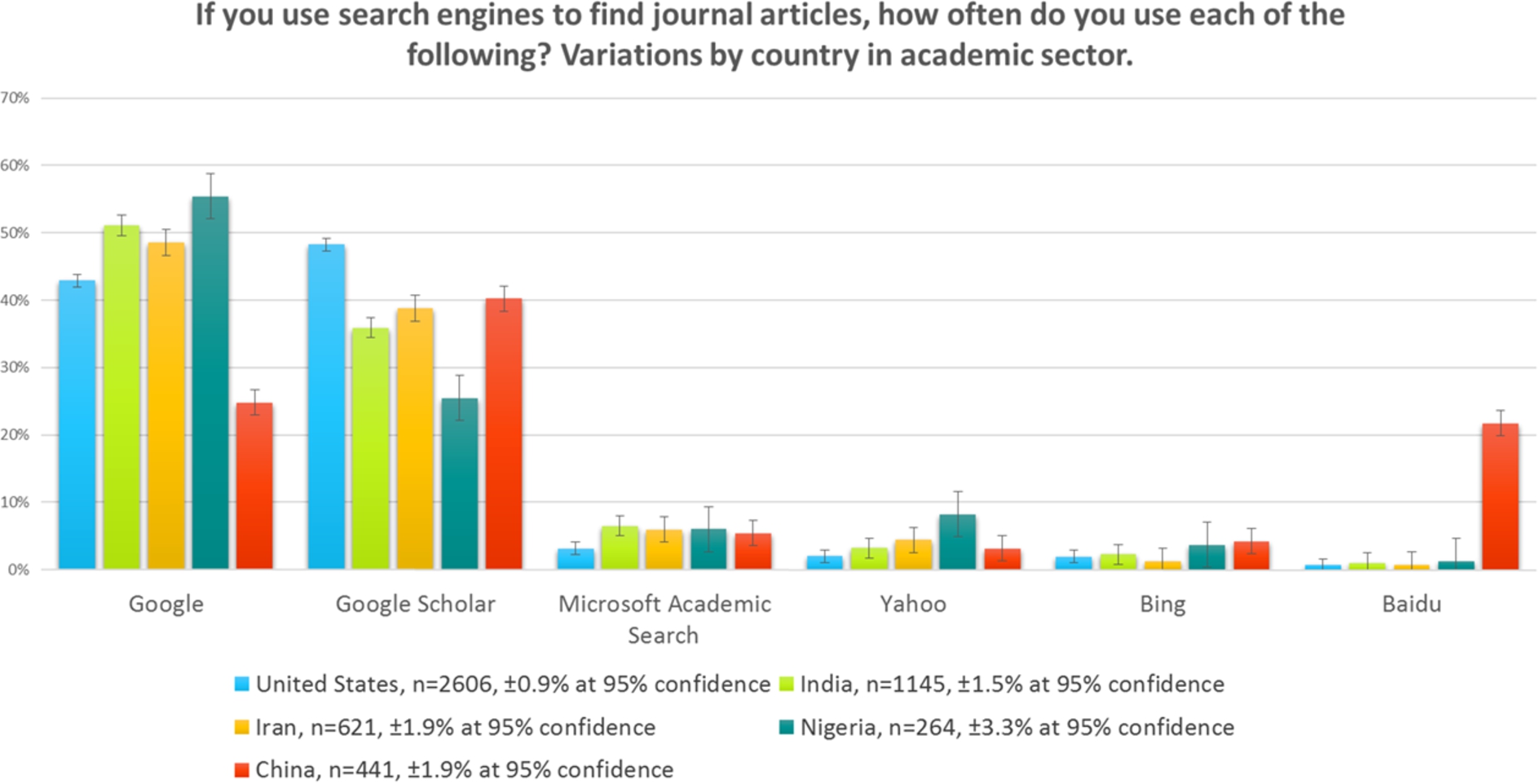
There are significant regional variations in the adoption of Google Scholar over Google within all sectors. Figure 7 shows the differences for the academic sector only. Google Scholar is used more than Google in the USA, a behaviour that we found mirrored in a large number of countries, such as United Kingdom, Netherlands, Germany, and Brazil. The use of Google Scholar seems to be reduced in many African and Asian countries. We presume this is a problem of awareness, since it cannot be a problem of price. Use of Google in China is known to be restricted to a degree, and it is not surprising that Baidu has as strong a presence as Google in China.
Further analysis of the relative use of Google Scholar versus Google in the academic sector in high-income countries is shown in Fig. 8.
Fig. 8.
Google vs. Google Scholar by subject, 2015.
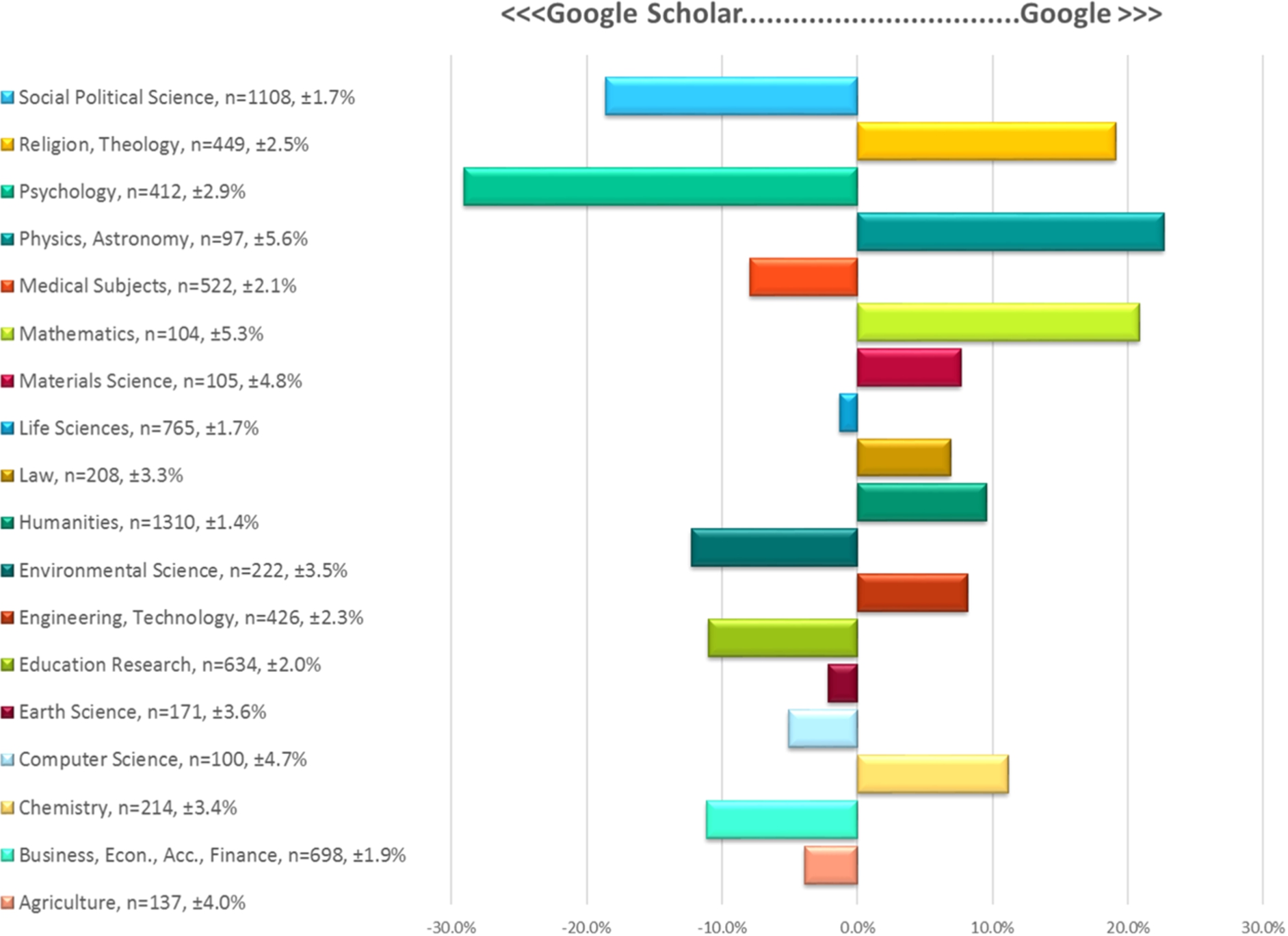
There is quite a large variance by subject area in people’s preference for Google vs. Google Scholar. People in the Social Sciences, Education, Law, and Business use Google Scholar more to find journal articles. However, people working in the Humanities and Religion and Theology prefer to use Google – this is surprising as you might assume that there is more similarity in the behaviour of people working and studying in the Humanities and Social Science fields. People working in Psychology have a strong preference for Google Scholar; people working in Physics and Mathematics have a strong preference for Google.
A brief visual inspection of the thumbnail of the 2012 results shown in Fig. 9 clearly shows the shift from 2012 to 2015 as nearly all the data points have moved starkly in the favour of Google Scholar.
During the period since the 2012 study, Google changed the way it indexed scholarly articles behind a paywall, making it much harder for individuals to see search results in many journals, especially the ones to which they do not subscribe. It is not unreasonable, therefore, to expect a shift to Google Scholar which does not have similar restrictions on what it will display to the user.
There is an increasing reliance on Google Scholar by people working and studying in the academic sector. This appears to be largely due to people leaving Google more than it is to people joining Google Scholar.
6.Delivery sites for journal articles
There has much debate about the number of journal articles retrieved from resources other than the publisher website. For example, librarians and publishers are interested in how often a reader retrieves the article from an institutional repository, a subject repository, or a professional/social networking site such as ResearchGate or Mendeley.
Fig. 9.
Google vs. Google Scholar by subject, 2012.
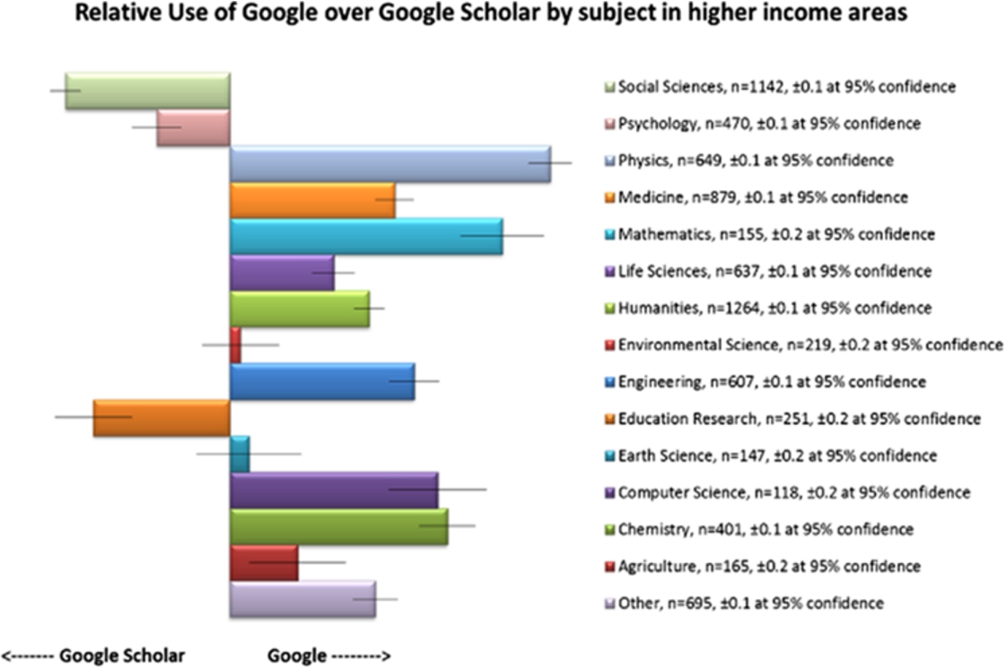
Figure 10 illustrates delivery site options for readers from the academic sector across the world. (Please refer to ‘Delivery Sites’ in Section 7, for a discussion on the calculations used in this section.)
The use of the publisher web site for delivery varies simply by income bracket, with most use being made of them by people from higher-income countries who one presumes are more likely to be in institutions with sufficient funding to purchase these resources. However, with projects like Hinari and Agora in place, one might have expected an improved position for low-income countries.
Fig. 10.
Delivery sites, academic by income, 2015.
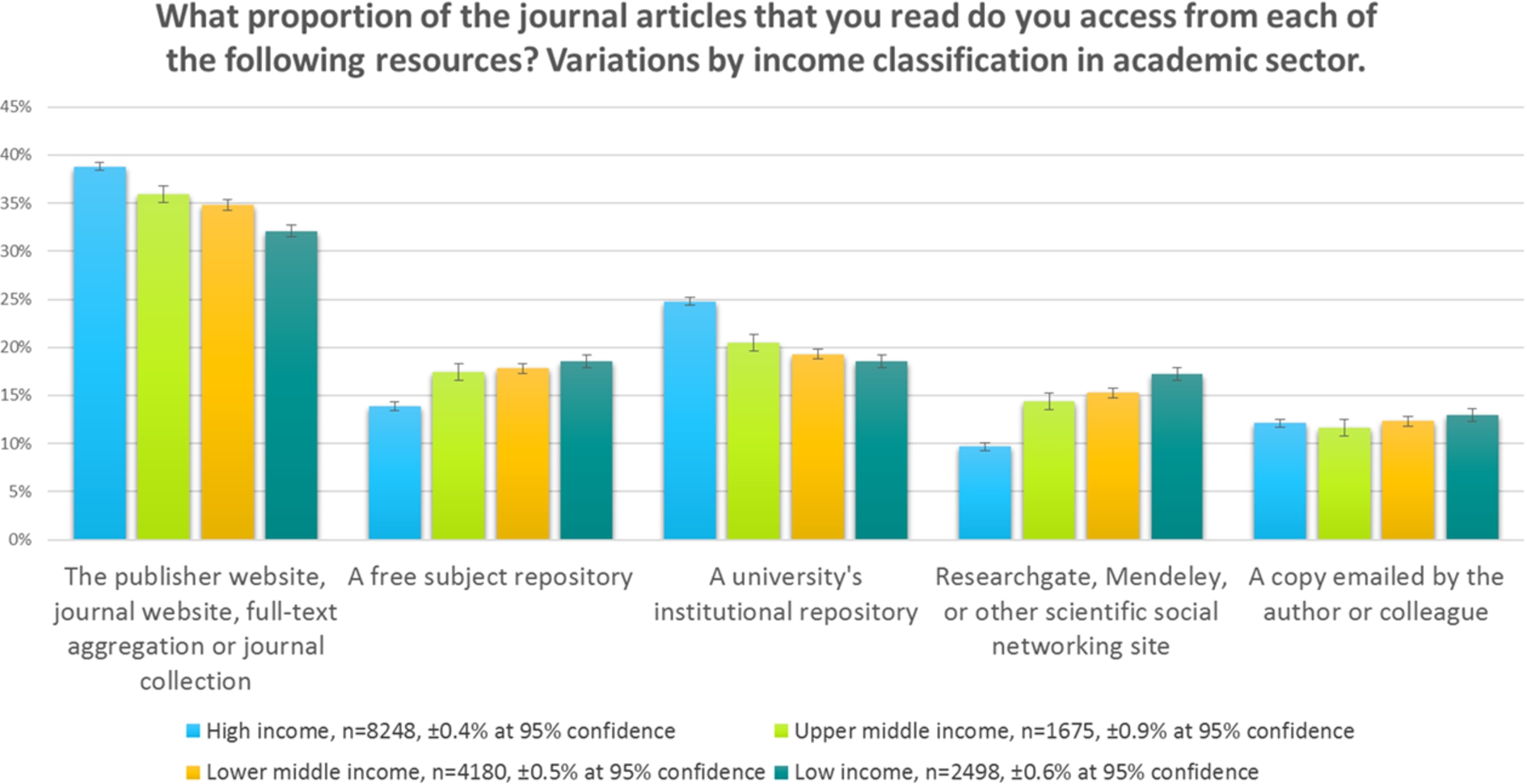
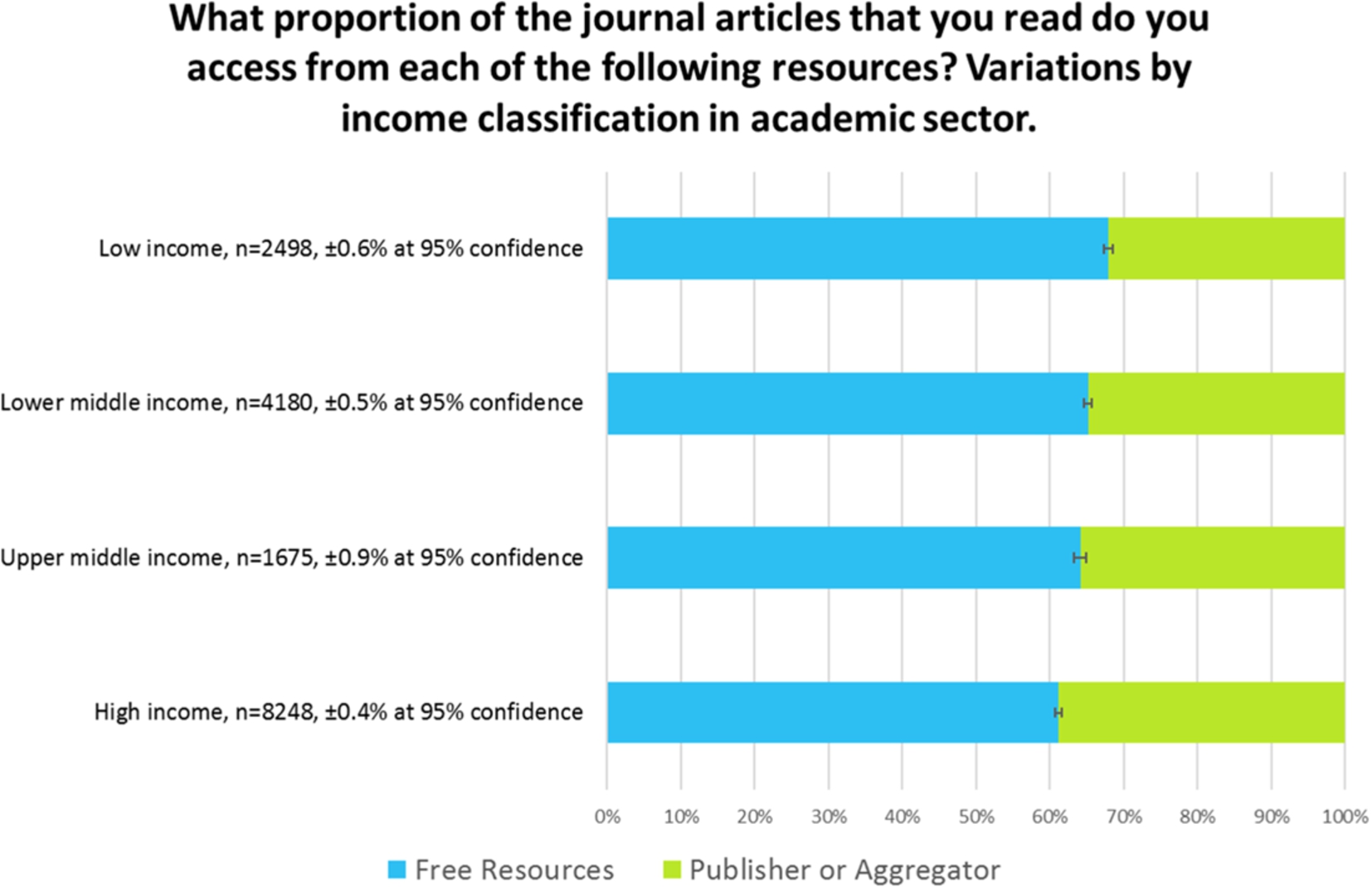
Fig. 11.
Delivery, free resources vs. publisher-controlled sites, 2015.
The use of institutional repositories seems to mirror the likelihood of an institution having installed one; i.e., in higher-income countries. This also tends to indicate that institutional repositories are used more by people who are familiar with them in their own institutions, rather than being seen as a global resource for delivery. After all, in aggregate, people in lower income countries use delivery sites that typically house free versions of articles the most (i.e. the sum of the use of sites other than the publisher or aggregator), and yet don’t use institutional repositories as much as part of the mix.
The reach of the subject repository, however, seems to be much more global, and is used proportionately more in poorer countries, as are sites such as ResearchGate and Mendeley.
Figure 11 shows the same data, replotted as a sum of publisher-controlled delivery sites, versus those that publishers do not control. All of the resources listed, apart from the publisher and aggregator category, represent an opportunity to download the article for free. We can see that over half of the downloads are from these sites. In addition, it should be remembered that many publisher sites contain open access journals, open access articles within subscription journals, free access to older material from many subscription journals, or gratis access as part of developing world initiatives. It follows, therefore, that the actual proportion of delivery that is free, is far greater than the amount shown here.
Readers in high-income countries in the academic sector perceive that they are accessing articles from a free resource approximately 60% of the time.
Articles come from sites such as ResearchGate and Mendeley less than 10% of the time in high-income countries. Institutional repositories are significantly more important in the academic sector, potentially indicating that people in this sector are more aware of institutional repositories. It follows from the findings in Fig. 6 where we showed that in higher-income countries people in academia are more likely to use Google Scholar for discovery than others, that, since Google Scholar will highlight results from institutional repositories, then academics will retrieve articles from repositories more, and that people in poorer countries will do so less.
It seems probable that a lack of awareness of Google Scholar in poorer nations is leading to a reduced use of free incarnations of content in institutional repositories from these regions.
Whilst some will consider the scale of the use of repositories to be unbelievable, the authors consider that such an argument is somewhat irrelevant to informing industry professionals of these trends. If the perception is that over half of the downloaded material is of free incarnations of the content, then this must have an impact on how subscriptions are funded in the future.
7.Methodology
This research carries on from, and expands upon, previous research undertaken in 2005, 2008, and 2012 (also by Simon Inger and Tracy Gardner) and attempts to follow the trends in behaviour over that period of time. Naturally, each time the survey is repeated, the authors have sought to keep the questions as consistent as possible with the questions in earlier surveys whilst keeping terminology current and tracking new developments. For this reason, the three key questions on reader behaviour were modified a little, some options reclassified, and additional options created. However, since those questions do not limit how many starting points the reader acknowledges as being important, this approach should have minimal impact on the results for any option present in the survey all the way from 2005 to 2015. No questions have been dropped since the research in 2012.
One of the key limitations of the older surveys was their reach. However, both the 2012 and 2015 surveys have reached very significant numbers of individuals. Consequently, demographic breakdowns are possible, by region, by subject, by major countries, and by World Bank income classifications. Our primary goal was to give us sufficient responses within each subject category to make for meaningful comparisons. We identified the subject areas we needed for our study and created a list of publishers and intermediaries who had content in those subject areas. We approached them over a period of six months until we had sufficient organisations as supporters to give us the best chance of reaching the numbers we needed.
Of course, since the invitations to take the survey were sent out by many publishers, some individuals will have been invited to take the survey more than once. At no point did we have sight of any email addresses from any of the supporting organisations and so no de-duplication was possible. However, we attempted to mitigate the effects of individuals taking the survey more than once by careful wording in the survey invitation – the standard invitation pointed out that if the respondent had received the survey invitation more than once, it was not intended as a prompt to take the survey twice, nor an indication that any previous response had not been received. In addition, the survey was incentivised, with three prizes of $100 Amazon vouchers or equivalent, but it was made clear that duplicate prize draw entries would be ignored.
8.Sample
For the reasons outlined above the sample used for the survey was not a random sample – surveyees were selected by our supporters who themselves were selected by their likely subject coverage. In addition, the contacts that each publisher used for the survey will be quite highly engaged with the publisher or intermediary – all of the contacts used will have opted-in to receiving emails of this type. The supporting organisations are based in the US, UK, France and The Netherlands, but their clientele are truly global, and the regional demographic breakdowns are testament to this.
9.Survey design and response rate
To ensure the highest response rate the survey was limited in size. We timed the survey to take about nine minutes and we advertised it as such.
40,443 people embarked on the survey, and 39,378 of them completed the demographics stage. At the end of the demographics, 36,562 people elected to take the journals survey, and 2,816 elected to take the books survey directly. Of the 36,562 people who took the journals survey, 29,991 of them completed the section on journals. At the end of the journals part, 27,656 people elected to continue to take the books survey too. This gave us a total of 30,472 starting the books survey, and 29,110 of them completed it.
In summary, therefore, 29,991 people completed the journals survey (74%), and 29,110 people completed the books survey (72%).
Each survey partner used a similar wording for their email invitations. Some used additional methods and media to reach potential surveyees and used various samples of their contact databases. As such, response rates are not always directly comparable. However, the approximate response rates were between 1% and 3%. Generally speaking, publishers who sent their invites out later in the process received a lower response rate, probably because their target audience had already been invited to the survey by another supporter.
10.Bias and limitations
Of course, any survey is limited in what it can achieve. We tried not to be leading in our questioning, but there are always limitations in the language used. In addition, although the audience was international, the survey was only conducted in English and so the interpretation of the language may be a factor in the accuracy of the responses. However, it should be noted that the surveyees will mostly consume journals and books in English.
The survey used invitations from our supporters, which were not necessarily a completely representative sample of the world of journal and online book readers. Furthermore, due to data privacy/data protection rules, all those invited to the survey via email will be quite highly-engaged with the publisher and have opted-in to receiving emails like these. This may bias their attitude to publisher web site features, or indeed their likelihood of having bookmarked a particular journal page. It may be, therefore, that external discovery platforms are even more important than portrayed in these results.
No control sample was used in this survey. With so many variables, of subject, region, job role and sector, it was decided that creating a control sample would be beyond the scope of this research project.
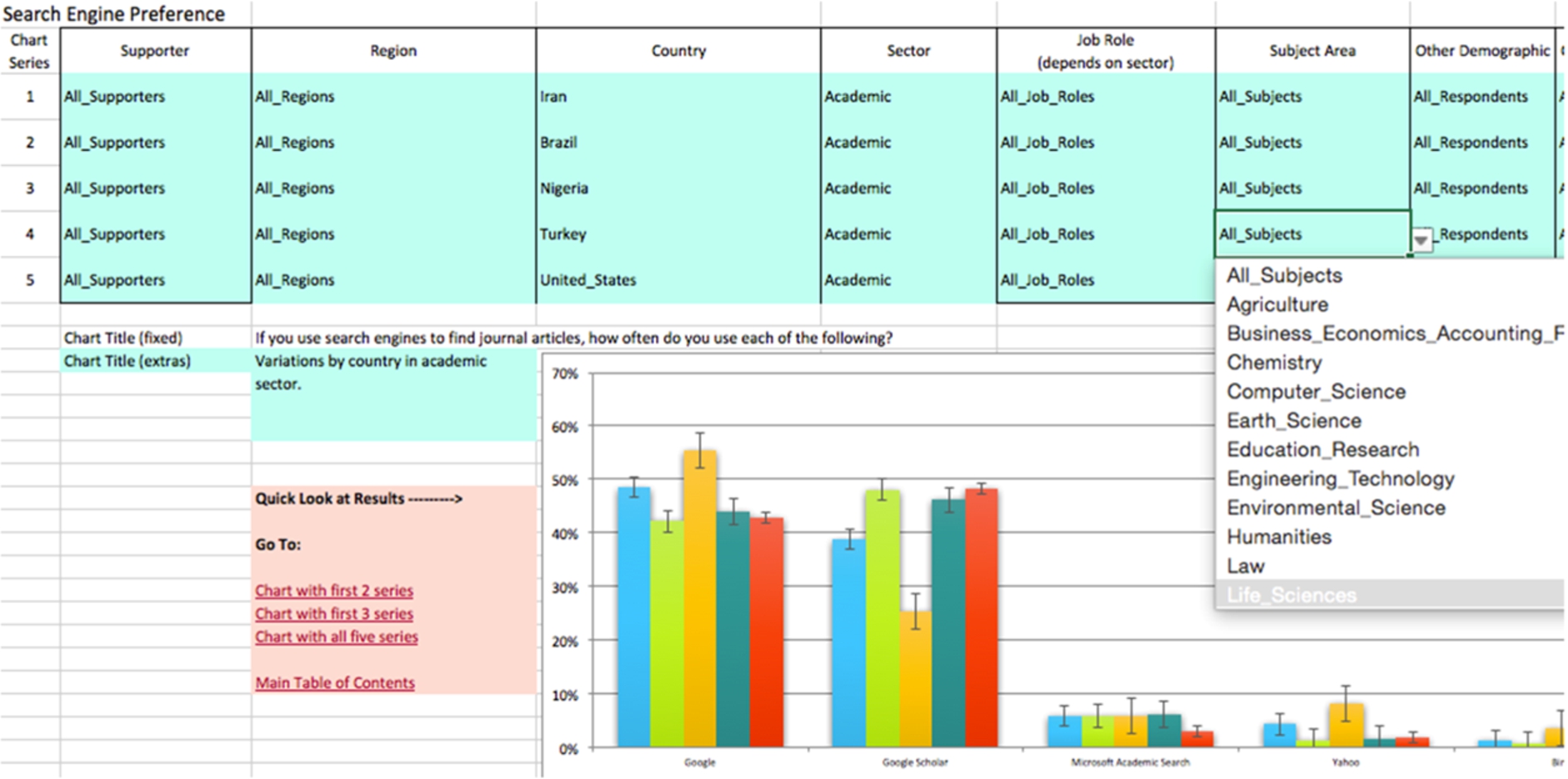
11.Analysis
Analysis was performed using Excel. Many of the results were reduced to binary arrays to make further comparisons easy to calculate. A tool was developed so that a number of comparisons could be made for each survey question easily. Figure 12 shows how the tool works, creating five series of data, each as a result of multiple demographics.
12.Error calculations
Throughout this document we have tried to keep demographic breakdowns of the data to quite large samples so as to minimise errors. All of the charts include error bars calculated at a 95% confidence interval, which of course in itself brings assumptions about the nature of the distribution of answers. The reader should be aware that with average luck, one in twenty of these calculations will be insufficient and the true reading will be out of the boundaries shown in the charts. They may not be far further adrift, but as with all survey results, the reader needs to exercise caution in interpreting any certainty in the outcomes shown.
For simplicity, the error bars shown for a given data series are the same. For example, if one measurement representing 30% of the responses carried with it an error of ±5%, and another measurement of 20% of the responses carried with it an error of ±4%, the chart would be plotted with both errors at ±4.5%. Therefore, some of the error bars for “popular” results will be slightly overstated. In reality, the plots in this report generally carry much smaller error ranges than in this example, and the differences between them would therefore be much smaller still.
Fig. 12.
Screenshot of analytical tool.
In some of the charts, with multiple breakdowns of the data, the error bars shown are those for the series being analysed with the fewest responses. This means that the errors for the remaining breakdowns are overstated. The reader should make a mental note of the response numbers ‘n’ clearly shown in each chart in making a judgement about the accuracy of the data. In these charts the actual error bars will be smaller than those shown for the great majority of the data points – a very cautious view of error has been used in these charts.
13.Comparison with 2005 and 2008
The survey, as conducted in 2008, was formed as similarly as possible to the original survey conducted in 2005. In both cases an invitation to take the survey was emailed to a large selection of readers of the supporters of each of those items of research. As already noted, it was imperative that the survey used language and terms as similar as possible to the prior research, that the medium of collection was the same (online survey), and the temptation to add greatly to the survey was resisted.
In 2005 and 2008, invitees to the survey were taken solely from those who had signed up for ToC alerts. It was noted in those surveys that this potentially affected the popularity of ToC alerts as a starting point in the findings. In 2012 and 2015, this bias is somewhat removed (although to what extent we cannot know exactly), and this seems to be apparent in some of the results.
Between 2005 and 2008, there was a shift in response demographic towards Life Scientists in North America, away from other demographics. In making those comparisons these shifts were taken into account. In comparing the data with the 2012 and 2015 data we have created a random sampling of the respondents to the 2012 and 2015 data down to the 2008 levels. This random sampling included a probability calculation which created broadly the same demographic breakdown in the 2012 and 2015 “down-sampled” set as in the 2008 set. For example, approximately one in thirty of the responses of those in Humanities were used, and 40% of them would be in North America. Overall the method seems to have created a set of data with similar demographics as the 2008 set, but not identical (of course).
The trend information is not available for all of the questions asked in this survey, because a number of them are new for 2012 and 2015, and some of the discovery platform options were introduced for the first time in 2012 also (such as Mendeley). Also some of the questions asked in 2005 and 2008 are now considered redundant – the practices that they recommended are now part of received wisdom.
14.Delivery sites
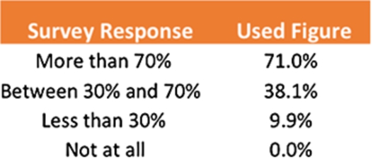
One of the survey questions tackles the question of content delivery. We asked ‘What proportion of the journal articles that you read do you access from each of the following resources?’ Surveyees were given a range of delivery site types and asked to simply say whether they used those sites more than 70% of the time, between 30% and 70% of the time, less than 30% of the time, or not at all. Naturally, some people voted for more than one item as more than 70%, or more than four items between 30% and 70%. To mitigate against this effect, we took the following approach.
For each response we assigned an approximate figure, of 75%, 35%, 15% and 0% to each of the four answers, added up the total of the percentages and created a correction factor for each person. For example, if a person’s answers added up to 200%, we divided all their responses by 2, i.e. the correction factor. We calculated a standard deviation figure for the correction factors. Through an iterative method we altered the assumed percentages above to reduce the standard deviation of correction factors to its minimum value, and so created a best fit of how to interpret the range of percentages given. These are given in Fig. 13.
Fig. 13.
Best fit used for percentage ranges quoted in survey.
With each response given the percentage above, the correction factor was reapplied to each respondent’s answers so that no-one could account for more than 100% of their time.
Answers from this question provide valuable insight into readers’ delivery options and so we wanted to test the effect of different derivations of these figures on the final published results. We found that any reasonable combination of numbers in the above table consistently produced the headline results reported in this work, and although changing the sizes of each result in absolute terms, never affected the relative ranking of results, and critically, never placed the use of free resources at less than the publisher-controlled resources.
15.Demographics
As shown in Fig. 14, the respondents to the survey come from an excellent regional spread and this allows for significant regional (and in some cases country) breakdowns, see below. 36,698 people told us their country (and hence region).
Fig. 14.
Respondents by region.
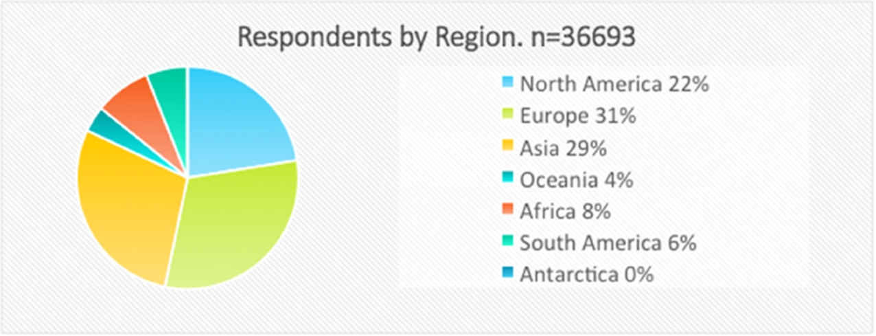
For the purposes of being able to apply demographic breakdowns by country for all of the survey questions, we separately identified all countries with more than four hundred respondents and then further clustered all other respondents within a region as one. In Europe this means we can analyse the behaviour of individuals from UK, Germany, Italy, France, Spain, Portugal, and The Netherlands and all of the other European respondents are grouped together as “All Other European Countries.” The same approach was taken with all other Continents. This year’s survey showed a reduced proportion of respondents from China than in the 2012 survey, but the absolute number of respondents from China is similar to the 2012 number.
Fig. 15.
Respondents by sector.
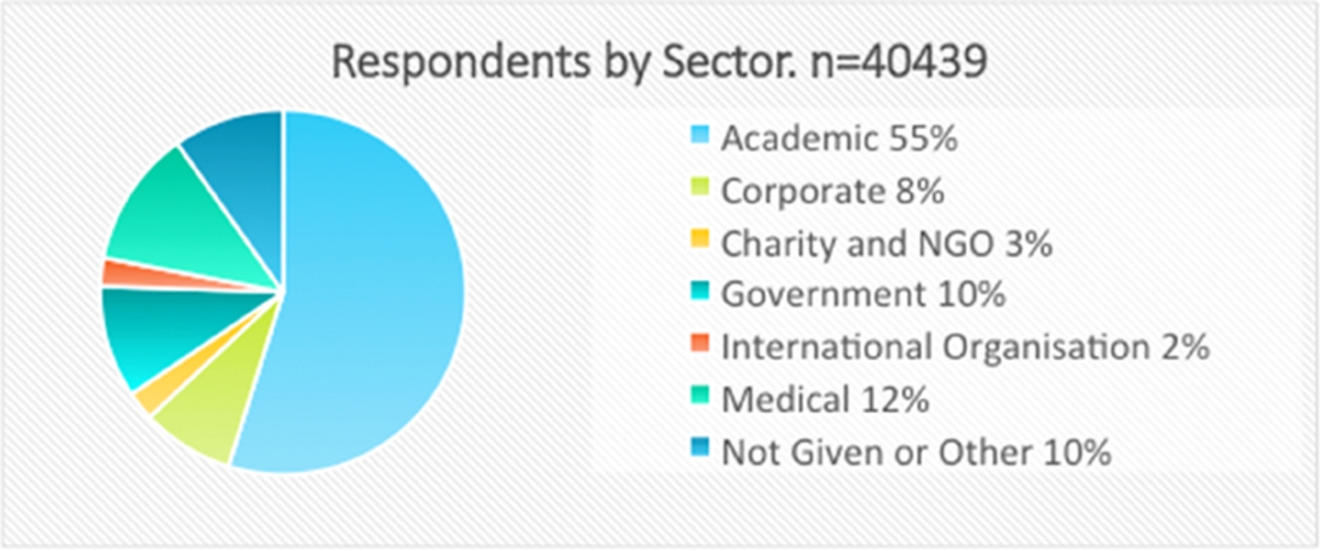
The sector-breakdown shown in Fig. 15 is also very good, with sufficient numbers in all but Charity/NGO and International Organisation to allow for further breakdowns by subject, region, and income. 40,439 people told us which sector they worked in. Although the academic sector dominates, even the 8% of respondents from the Corporate sector represents over 3,000 people.
Fig. 16.
Respondents by subject area and region.
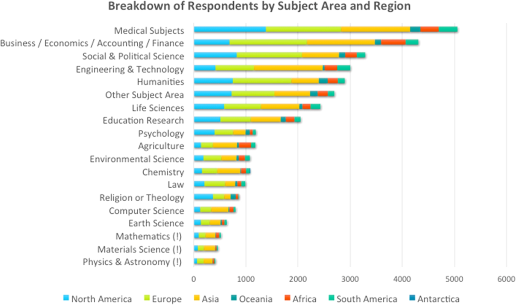
When embarking on this project, our aim was to get around one thousand responses in each subject area, so that detailed demographic analysis would be possible within subjects with minimal error-bars. This was achieved for twelve of the subject areas, see Fig. 16, and three more subject areas got over six hundred responses, which still allows for some useful further sub-division. Materials Science, Physics and Mathematics (marked with ‘!’) are the least well-represented in the data, although in absolute terms there are enough individuals in these areas to allow for a useful subject-based analysis, even if not when combined with a further demographic, other than perhaps the Academic sector demographic, or the Asia demographic.
Within these subject areas we have achieved a useful regional split, although we do not have any corroborating evidence to show whether or not these are in any way in proportion to the numbers of individuals in each subject area in each of the regions.
16.Conclusions
Content discovery remains a highly-competitive space with no clear winner – people use a wide range of discovery methods and tactics for perfectly good and logical reasons. There is no single “right” answer.
A key differentiator in behaviour appears to be the awareness of the range of resources available, evidenced in many comments. This awareness seems to be strongest in the academic sector in wealthier nations where presumably information literacy training is having a positive effect, coupled with the availability of a wide range of discovery options. In the corporate and charity sectors, even in the developed world, readers seem to show a lower level of search sophistication; for example, relying on general search engines, even in the face of free scholarly discovery resources. For some, of course, the limited availability of content resources dictates an alternative discovery and delivery strategy.
The investment and improvements in both library discovery services and publisher websites seem to be paying off. Both of these categories have seen rises in popularity, especially in the academic sector, since 2012. At the same time, the Abstracting and Indexing databases (A&Is) seem to have lost some ground, whilst remaining, in many subjects and sectors, the most important discovery resource.
Acknowledgements
This work would not have been possible without the support of the following organisations, who between them executed hundreds of thousands of invitations to readers of scholarly and professional publications asking them to participate in this survey. Our heartfelt thanks go out to them all: Annual Reviews, American Theological Library Association (ATLA), The Bone & Joint Journal, Brill, Cambridge University Press, The IET, ingentaconnect, The JAMA Network/American Medical Association (AMA), OECD, SAGE, and Wiley. The full report on this survey [1] is available from the Simon Inger Consulting web site.
About the authors
Simon Inger is a long-standing consultant in scholarly publishing with a long track-record of work in delivery and discovery of e-resources, ever since the very start of journal delivery online in 1995. He works extensively with publishers (not-for-profit and commercial) in the US, Europe and Asia, with major content intermediaries and service providers, and also runs training courses for libraries and publishers in e-resource delivery.
Tracy Gardner has worked in journals since 1997. She has a very broad view of publishing having worked for publishing technology companies (CatchWord and Ingenta), a not-for-profit publisher (CABI Publishing), and thereafter in consultancy, on various projects for publishers, intermediaries and libraries. Tracy is a trainer on UKSG’s E-Resources Technical Update course, and its Licence and Negotiation Skills course, as well as courses for publishers by Renew Training in association with ALPSP.
Reference
[1] | T. Gardner and S. Inger, How readers discover content in scholarly publications (online only: http://sic.pub/discover). ISBN 978-0-9573920-4-5. |