
Promoting Latino self-management through use of information visualizations: A case study in New York City
Abstract
Social determinants of health, including low health literacy and limited English proficiency, and other factors place Latinos at high risk for health disparities related to chronic diseases. Such diseases require self-management skills as well as medical management. Well-designed visualizations are suitable for visualizing data related to self-management because they can help narrow the comprehension gap between individuals with low and high levels of health literacy by leveraging existing visual analysis skills while reducing the demand on literacy and numeracy competencies. Use of information visualizations also supports a common visual representation across languages to address limited English proficiency. This report illustrates the use of information visualizations for communication related to self-management through research-based case examples and summarizes key lessons from studies with Latinos in New York City.
1.Introduction
About one-third of New York City residents is Latino. Although most are U.S. born, some neighborhoods have many immigrants. One such neighborhood is Washington Heights/Inwood in Northern Manhattan which has the largest population of Dominicans outside of the Dominican Republic.
New York City’s community profile data provide documentation about the social determinants of health [1]. Seventy-two percent of the residents of Washington Heights/Inwood are Latino, 47% were born outside the U.S., and 37% have limited English proficiency. The high school graduation rate of 68% is lower than New York City overall and 29% have less than a high school education. In Washington Heights/Inwood, 20% of residents live in poverty, 12% are unemployed, 53% are rent burdened (i.e., paying >30% of their income for rent), and incarceration rates are higher than the rest of Manhattan. Only one-third of renters live in housing without maintenance defects and 28% have cockroaches. Of relevance to a healthy food environment, the ratio of supermarkets to bodegas is 1:13 with the latter offering less healthy food. While these and other social determinants negatively influence health, 80% of Washington Heights and Inwood rate their neighbors as willing to help them - and 35% of the roads have bike lanes.
In terms of maternal-child health, the teen pregnancy rate is 2.3% with rates of late or no prenatal care and preterm births, 6.1% and 7.3%, respectively. The childhood obesity rate is 24%; and 23% of adults report no physical activity in the last 30 days. Fourteen percent of Washington Heights/Inwood residents are without health insurance and 17% are without needed medical care. The rate of avoidable hospitalizations among adults in Washington Heights and Inwood is higher than the citywide rate while the rate of adult psychiatric hospitalization is lower. Adult residents experience high rates of obesity (26%), diabetes (13%), hypertension (28%) and there are 31.1 new HIV diagnoses per 100,000 residents. The three leading causes of premature death are cancer, heart disease, and drug-related. Although community statistics for Alzheimer’s Disease and Related Dementias (ADRD) are not available in New York City’s profiles, studies document higher rates among Latinos accompanied by high levels of care burden [2].
These stark statistics reflect the context of our program of Latino health disparities research that is informed by the socioecological model [3]. The purpose of this report is to illustrate the use of information visualizations for communication related to self-management through research-based case examples and to summarize key lessons learned from studies with Latinos in New York City. Self-management is a critical component of prevention and management of chronic diseases including hypertension and diabetes and related lifestyle factors. Self-management skills also are essential for ADRD caregivers as they manage the health of their family member with ADRD as well as their own health. While not specific to Latinos, the authors also address familial hypercholesterolemia, a biomarker finding of relevance to Latinos that requires self-management.
2.Information visualizations as a strategy for communication
Information visualization comprises a set of approaches that vary in objective from abstract data exploration to presentation of information through infographics of varying levels of complexity [4]. The focus of this report is on the latter. The use of information visualizations as a communication strategy for the authors research with Latinos was motivated by multiple factors. First, we conducted community-based research through the Community Engagement Resource of the Irving Institute for Clinical and Translation Research that revealed research participants wished to receive individual and aggregate results and results should be presented in a comprehensible and actionable manner. Second, as part the Washington Heights/Inwood Informatics Infrastructure for Comparative Effectiveness Research (WICER) project, the authors surveyed almost 6,000 Latinos in our community, most with limited health literacy, and wanted to return the research results to help improve the health of the community (as well as to enhance the trust between the community and academic researchers) [5,6]. Third, well-designed visualizations can help narrow comprehension gaps among individuals with low and high levels of health literacy by leveraging existing visual analysis skills while reducing the demand on literacy and numeracy competencies [7]. Fourth, many participants in the authors’ research studies prefer to communicate in Spanish - and use of infographics enables a common visual representation across languages with textual components in the language of choice.
The design of infographics is inherently an interdisciplinary process and our teams include domain experts in health (nursing, medicine, public health) with backgrounds in fields with a strong visualization component including informatics, data science, art, theatrical design, and fashion design. We employ an iterative, five phase hybrid participatory approach to infographic design and evaluation that combines activities among the design experts with the intended users of the infographics [8]. Briefly, the five phases contain these strategies:
Phase 1: Defining the intended audience and purpose is informed by a taxonomy of infographic purposes and consideration of visualization components that match the purposes [9]. For each project, the authors characterize the intended viewers from their sociodemographic perspective as well as their information and communication needs [9–11].
Phase 2: Understanding the data is critical to an efficient design process as well as the identification of design opportunities and challenges [12]. It involves three major components: (a) determining the meaning of the variable to be visualized; (b) identifying the possible and likely values; and (c) understanding how values are interpreted.
Phase 3: Participatory design is an iterative process and may be implemented through a variety of approaches. Most typically, the authors use either group or individual design sessions with the intended users of the infographics and begin with some initial prototype designs to stimulate conversation about designs [8,13]. We refine the designs between sessions as needed and typically gather intended user perceptions about the comprehensibility, preferences, and actionability of the infographic.
Phase 4: Automation is fundamental to tailoring infographics to user characteristics and data values at scale. Consequently, the authors created the Electronic Tailored Infographics for Community Engagement, Education, and Empowerment (EnTICE3) software framework [14]. We also developed a style guide, a type of structured communication tool, to facilitate communication between the infographic designer and the software programmer [15].
Phase 5: Evaluation is tied to the purpose of the infographic and the iterative design process [8]. Any infographic should adhere to heuristics for good visual design and health-literate communication practices - and be comprehensible to its intended user. The former is the purview of the experts in the design process and may occur through a variety of formal and informal strategies with individuals (e.g., think aloud protocols, heuristic evaluation checklists) or groups (e.g., design studio) of experts. The latter relates to the intended users (e.g., research participants, patients, clinicians) of the infographic and may be assessed through gist comprehension approaches or more experimental strategies. Since the major focus of the authors research is self-management, actionability is another key aspect of our evaluation approach with Latinos, i.e., we want to know if the infographic will motivate the user to take positive action (e.g., increase physical activity level). During the design process, this is frequently captured through intent to take action. Additional studies are needed to determine if the infographic actually results in a self-management behavior (e.g., adhere to HIV medication) and subsequent outcome (e.g., reduced viral load).
3.Case examples with information visualizations
In this report, the authors illustrate the use of information visualizations to promote self-management by introducing three research projects: (a) the Washington Heights/Inwood Informatics Infrastructure for Comparative Effectiveness Research (WICER) project; (b) the New York City Hispanic Dementia Caregiver Research Program (NHiRP), and (c) the Precision in Symptom Self-Management (PriSSM) Center.
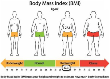
One aspect of the WICER project was a community survey of almost 6,000 Latinos [5,6]. As part of our ongoing community engagement strategies, the authors wanted to return research data to survey participants. Because the majority of the sample had low health literacy, we decided to use information visualizations (i.e., infographics) and applied a hybrid participatory design approach to create the infographics [8,9,13]. We conducted 16 of 21 design sessions with survey participants in Spanish. Infographic designs were refined between sessions based on gist comprehension, acceptability, and perceived actionability of the infographics [13]. Given that the clinical focus of the WICER project was hypertension, [16] most infographics focused on high blood pressure and its risks (Fig. 1) as well as intervention targets for lifestyle modification including obesity (Fig. 2) and low physical activity (Fig. 3).
Fig. 1.
Hypertension infographic.
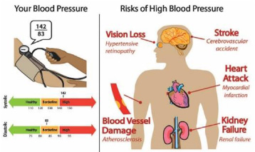
Fig. 2.
BMI infographic.
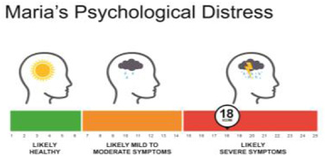
For NHiRP, the authors primary focus was to design infographics to help dementia caregivers understand their symptoms, caregiving burden, and health status in order to motivate and support self-management strategies. The latter is particularly important given that individuals who provide care for those with dementia have caregiving demands that exceed other chronic conditions - and tend to be older with existing comorbidity issues (and often ignore their own health needs) [17,18]. A infographics-caregiving focus is especially important among Hispanics who are 1.5 times as likely to have dementia compared to non-Hispanic Whites [19]. The iterative participatory design processes for NHiRP included a graphic designer in the design sessions with dementia caregivers. Figure 4 displays the infographic for caregiver psychological distress [20] based on the responses to the Kessler Psychological Distress Scale [21].
Fig. 3.
Physical activity infographic.
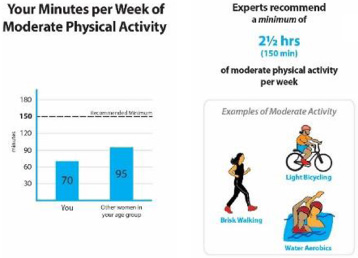
Fig. 4.
Caregiver psychological distress.
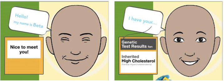
One component of the PriSSM Center is a Visualization Design Studio - in which visualization experts and other researchers convene to create and evaluate information visualizations for various purposes including return of research data to participants, patient-provider communication, mobile health apps, clinical dashboards, and publication of research results. In terms of the first purpose, the authors extended design work beyond the self-reported data reflected in the WICER project and NHiRP to genomic data including Ancestry Informative Markers and common and rare variants. This included a prototype of multi-media experiential visualizations to motivate action related to familial hypercholesterolemia, a treatable condition that is passed down through families [22].
Designed specifically for Latinos with limited health literacy and limited English proficiency, Woolen’s novel prototype focuses on communicating risk as a feeling rather than a probability by leveraging vicarious learning via real patient experience materials (e.g., quotes, videos) and empathy with an emotive relational agent (Fig. 5). The authors compared the prototype to standard methods of communicating genetic risk using a mixed-methods approach. The findings suggested participants had difficulty correctly processing standard methods of communicating risk information, such as risk numbers, even when supported by visual aids. Comprehension alone did not result in intent to take action.
In contrast, the multi-media experiential visualizations affected an emotional response, which dually influenced perceived ease of understanding and motivation to take action on the information. While clear aesthetic design increased participant confidence in their understanding, emotionally connecting with the visualizations appeared to play a key role in participant engagement with the information.
4.Key lessons
The authors learned some key lessons across the five phases of our iterative hybrid participatory design approach for infographic design and evaluation. Effective design requires not only an in-depth understanding of the intended audience and purpose of the infographic, but also an understanding of the possible and actual data values. For example, on a scale for assessing the mental functioning of a person with ADRD compared to ten years prior, it is not relevant (and may be disheartening) to display a valid score indicating marked improvement because current ADRD treatments may slow the transition to less function without restoring function.
Fig. 5.
Relational agent for multi-media experiential visualizations.
Although methods vary according to study purpose, participatory design with the intended users of the infographics is a core component across our studies with Latinos. This has been essential to tease out design features that work from those which do not. For example, while number lines with red/green (e.g., systolic blood pressure, anxiety) or red/orange/green (e.g., body mass index) reference ranges have been perceived as comprehensible and actionable, several other features have received mixed reactions [13]. Icon arrays, with the exception of star ratings for overall health, have been interpreted inaccurately – most typically due to a literal interpretation of an icon designed to display a more general concept, (e.g., carrot for vegetable consumption, sneakers for physical activity). Consequently, the authors now use simple bar graphs to present these measures. Moreover, participatory design supports discovery of cultural nuances that are essential to interpretability as well as actionability.
In terms of automation, it can be difficult for an infographic designer to communicate to the programmer the exact specifications to create a tailored infographics without a formal structure. The creation of a style guide facilitates the communication through specification of the necessary features, range and type of data values, and an example of the desired output [15].
While essential, evaluation can be difficult with individuals with limited health literacy. In one study, the authors developed and implemented an elegant experimental protocol in which individuals were asked a set of questions related to two similar sets of information – one displayed as an infographic and the other as text [23]. However, many participants found the evaluation task overwhelming and tended to focus on their subjective impressions rather than on the information displayed in the protocol. Consequently, we adopted more qualitative approaches that support probing for additional information from participants if needed.
5.Conclusion
Information visualizations are a key strategy for communicating with Latinos across levels of health literacy. Although, the authors have generated some principles from our research studies that we re-apply across projects, participatory design with the intended user(s) remains a crucial strategy to create visualizations which are perceived as understandable, engaging and actionable for self-management purposes. In addition, interdisciplinary research teams possessing the knowledge and skills to design, implement, and evaluate information visualizations are needed to produce effective designs that are health literate and culturally appropriate. Moreover, there is a need for information visualization toolkits that support individuals with less specialized knowledge and skills in design and evaluation, who possess expertise within communities of interest to apply the best practices and resources developed by others. The latter is particularly important for Latinos and other racial and ethnic minorities at high risk for health disparities.
References
[1] | New York City Department of Health and Mental Hygiene. Community profiles 2018: Washington Heights and Inwood. New York City Department of Health and Mental Hygiene, New York, NY, 2018. |
[2] | J.A. Luchsinger, D. Tipiani, G. Torres-Patino, S. Silver, J.P. Eimicke, M. Ramirez, J. Teresi and M. Mittelman, Characteristics and mental health of Hispanic dementia caregivers in New York City, Am J Alzheimers Dis Other Demen 30: : ((2015) ), 584–590. doi:10.1177/1533317514568340. |
[3] | Centers for Disease Control and Prevention. Social ecological model. 2015, http://www.cdc.gov/ViolencePrevention/overview/social-ecologicalmodel.html. |
[4] | A. Cairo, The Functional Art: An Introduction to Information Graphics and Visualization. New Riders, Berkeley, CA, (2012) . |
[5] | T.A. Koleck, N. Suero-Tejeda and S. Bakken, The influence of Latino symptom experience on participation in usual activities and satisfaction with participation in social roles, Hisp Health Care Int 16: : ((2018) ), 134–144. doi:10.1177/1540415318803947. |
[6] | Y.J. Lee, B. Boden-Albala, E. Larson , Online health information seeking behaviors of Hispanics in New York City: a community-based cross-sectional study, J Med Internet Res 16: ((2014) ), e176. doi:10.2196/jmir.3499. |
[7] | R. Garcia-Retamero, Y. Okan and E. Cokely, Using visual aids to improve communication of risks about health: a review, Scientific World Journal 2012: ((2012) ), 562637. doi:10.1100/2012/56263. |
[8] | A. Arcia, J. Merrill and S. Bakken, Consumer engagement and empowerment through visualization of consumer-generated data, in: Consumer Informatics and Digital Health, M. Edmunds, C. Hass and E. Holve (eds), Springer, Cham, Switzerland, (2019) , pp. 183–203. |
[9] | A. Arcia, M.E. Bales, W. Brown , Method for the development of data visualizations for community members with varying levels of health literacy, AMIA Annu Symp Proc 2013 ((2013) ), 51–60. |
[10] | S. Iribarren, S. Stonbraker, N. Suero-Tejeda , Information, communication, and online tool needs of Hispanic informal caregivers of individuals with Alzheimer’s disease and related dementias, Inform Health Soc Care 2018: : ((2018) ), 1–20. doi:10.1080/17538157.2018.1433674. |
[11] | S. Stonbraker, S. Richards, M. Halpern , Priority topics for health education to support HIV self-management in limited-resource settings, J Nurs Scholarsh 51: : ((2019) ), 168–177. doi:10.1111/jnu.12448. |
[12] | A. Arcia, J. Woollen and S. Bakken, A systematic method for exploring data attributes in preparation for designing tailored infographics of patient reported outcomes, eGEMS (Generating Evidence & Methods to Improve Patient Outcomes 6: : ((2018) ), 1–9. doi:10.5334/egems.190. |
[13] | A. Arcia, N. Suero-Tejeda, M.E. Bales , Sometimes more is more: iterative participatory design of infographics for engagement of community members with varying levels of health literacy, J Am Med Inform Assoc 23: : ((2016) ), 174–183. doi:10.1093/jamia/ocv079. |
[14] | M. Velez, M.E. Bales, A. Arcia and S. Bakken, Electronic tailored infographics for community engagement, education, and empowerment (EnTICE3) (Abstract). AMIA Joint Summits on Translational Science Proceedings 2014, eCollection 2014, 205. |
[15] | A. Arcia, M. Velez and S. Bakken, Style Guide: An interdisciplinary communication tool to support the process of generating tailored infographics from electronic health data using EnTICE3, EGEMS (Wash DC) 3: ((2015) ), 1120. doi:10.13063/2327-9214.1120. |
[16] | M. Lor, T.A. Koleck, S. Bakken and A.M. Dunn-Navara, Association between health literacy and medication adherence among Hispanics with hypertension, J Racial Ethn Health Disparities ((2019) ), Epub ahead of print. doi:10.1007/s40615-018-00550-z. |
[17] | E.M. Friedman, R.A. Shih, K.M. Langa and M.D. Hurd, US prevalence and predictors of informal caregiving for dementia, Health Aff (Millwood) 34: : ((2015) ), 1637–1641. doi:10.1377/hlthaff.2015.0510. |
[18] | M.T. Littleton-Kearney and P.A. Grady, The science of caregiving bringing voices together: summary of National Institute of Nursing Research’s 2017 summit, Nurs Outlook 66: : ((2018) ), 157–159. doi:10.1016/j.outlook.2018.02.002. |
[19] | B.J. Gurland, D.E. Wilder, R. Lantigua, Y. Stern, J. Chen, E.H. Killeffer and R. Mayeux, Rates of dementia in three ethnoracial groups, Int J Geriatr Psychiatry 14: : ((1999) ), 481–493. |
[20] | A, Arcia, N. Suero-Tejeda, N. Spiegel-Gotsch, J. A. Luchsinger, M. Mittelman and S. Bakken, Helping Hispanic Family Caregivers of Persons With Dementia “Get the Picture” About Health Status Through Tailored Infographics, The Gerontologist 6 11 ((2019) ). doi:10.1093/geront/gnz085. |
[21] | R.C. Kessler, G. Andrews, L.J. Colpe, E. Hiripi, D.K. Mroczek, S.L.T. Normand and A.M. Zaslavsky, Short screening scales to monitor population prevalences and trends in non-specific psychological distress, Psychological Medicine 32: : ((2002) ), 959–976. doi:10.1017/S0033291702006074. |
[22] | J. Woollen, A visual approach to improving the experience of health information for vulnerable individuals, Ph.D. Dissertation, Department of Biomedical Informatics, New York, NY, Columbia University, 2018. |
[23] | A. Arcia and S. Bakken, Experimental protocol to assess comprehension and perceived ease of comprehension of tailored health infographics compared to text alone (Abstract). AMIA Annual Symposium Proceedings 2014, eCollection 2014, 1314. |